

Tao Coffee Co
Loading project images
Lorem ipsum dolor sit amet, consectetur adipiscing elit.
Integer vel neque eu libero dignissim pellentesque at vitae felis.
Note
Donec sed augue vitae augue sodales convallis. Nulla facilisi. Vivamus interdum, libero sed posuere volutpat.
Extract
Pellentesque habitant morbi tristique senectus et netus et malesuada fames ac turpis egestas.
Caption
Praesent et sapien at justo hendrerit cursus. Suspendisse potenti. Aliquam erat volutpat.
Scope of Work
Included services: Brand Strategy, Visual Identity, Packaging, Collaterals.
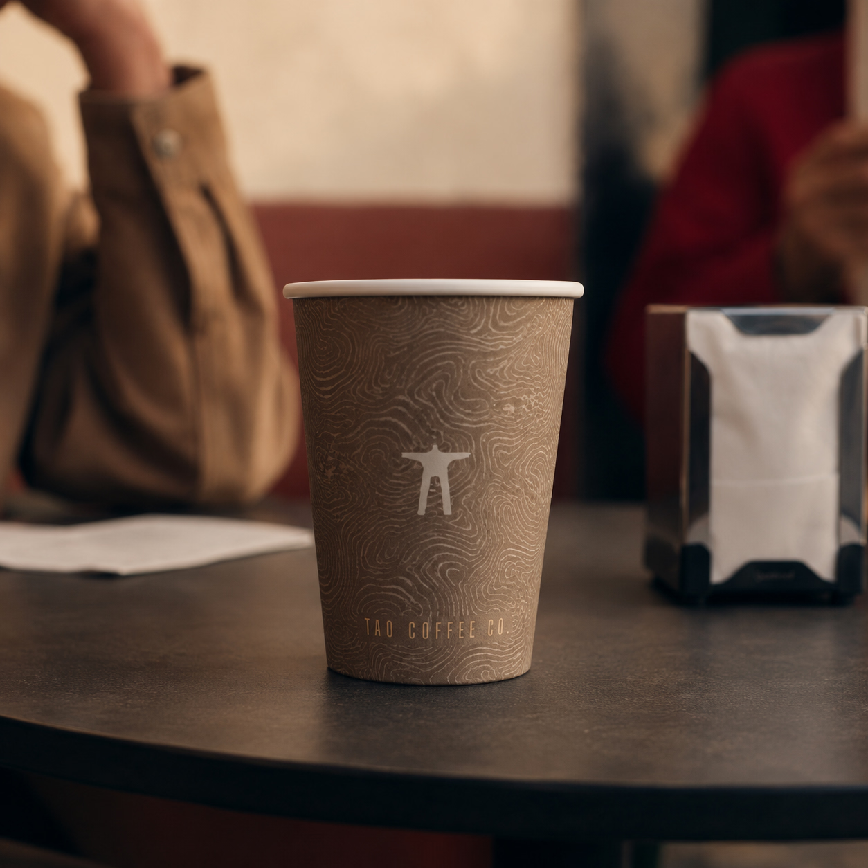
Tao Coffee Co is a coffee brand built around people as much as product.
Process
Idea
Taking tao—person or human—as its central idea, the identity frames coffee as a daily social ritual, with a warm, direct system that can move across the café, packaging, menus, and takeaway formats.
System
The visual language favors human scale over specialist theater. Straightforward typography, tactile color, and small moments of illustration make information about drinks and coffee easy to approach. The mark can sit comfortably on a cup, bag, sign, or stamp without needing a different expression for each surface.
Behaviour
Every touchpoint keeps attention on exchange: the person preparing the coffee, the person drinking it, and the space between them. Tao Coffee Co feels considered without becoming precious.