

Kimbap Kidding
Loading project images
Lorem ipsum dolor sit amet, consectetur adipiscing elit.
Integer vel neque eu libero dignissim pellentesque at vitae felis.

Note
Donec sed augue vitae augue sodales convallis. Nulla facilisi. Vivamus interdum, libero sed posuere volutpat.
Extract
Pellentesque habitant morbi tristique senectus et netus et malesuada fames ac turpis egestas.
Caption
Praesent et sapien at justo hendrerit cursus. Suspendisse potenti. Aliquam erat volutpat.
- #DDDBD1
- #AFAE8E
- #E97D71
- #A68E77
- #87987B
- #E46152
- #BB833D
- #ED2C1F
- #D34844
- #C0442F
- #CF291F
- #B91F0F
- #B52524
- #A11812
- #585451
- #575533
- #971711
- #3E5333
- #810F0A
- #501109
- #2C2A27
- #1B1B18
- #1B0506
- #020202
Scope of Work
Included services: Brand Strategy, Visual Identity, Packaging, Collaterals.
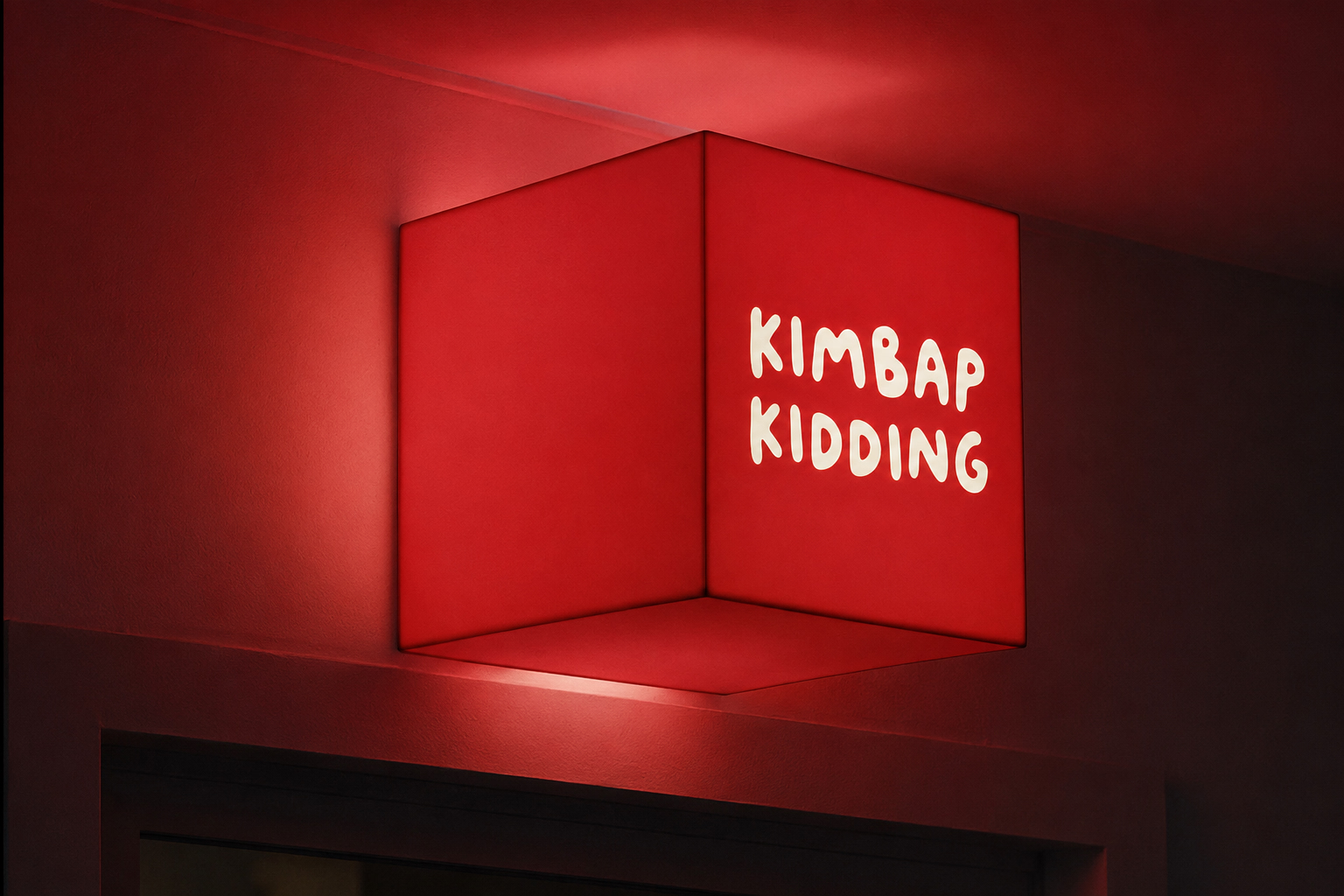
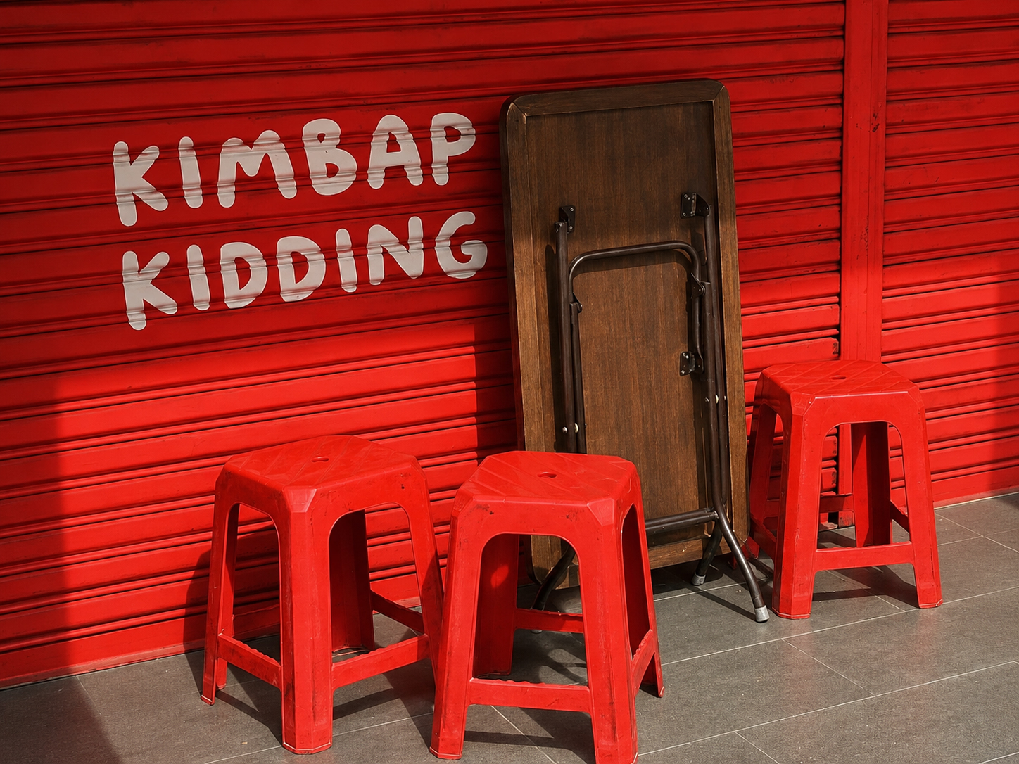
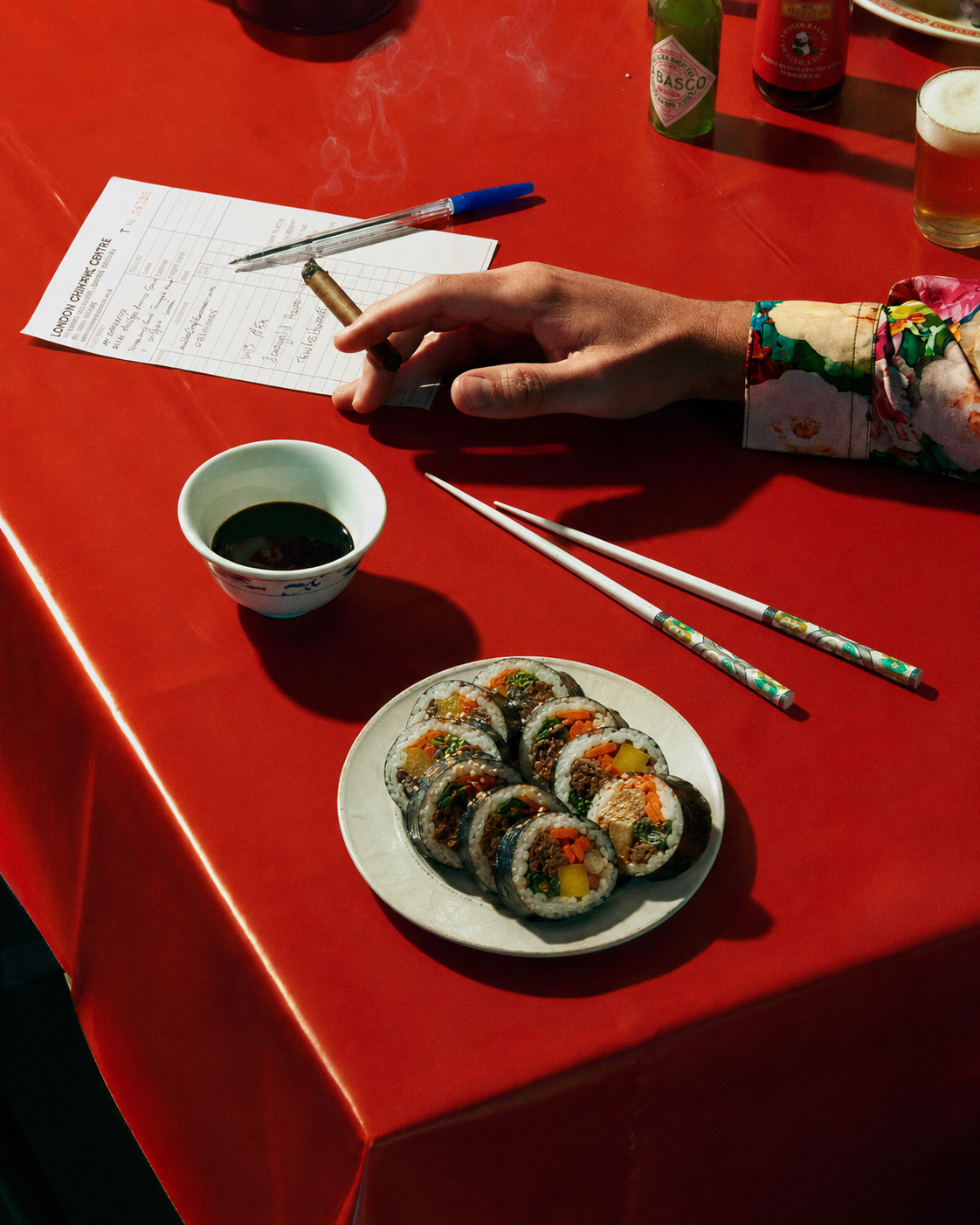
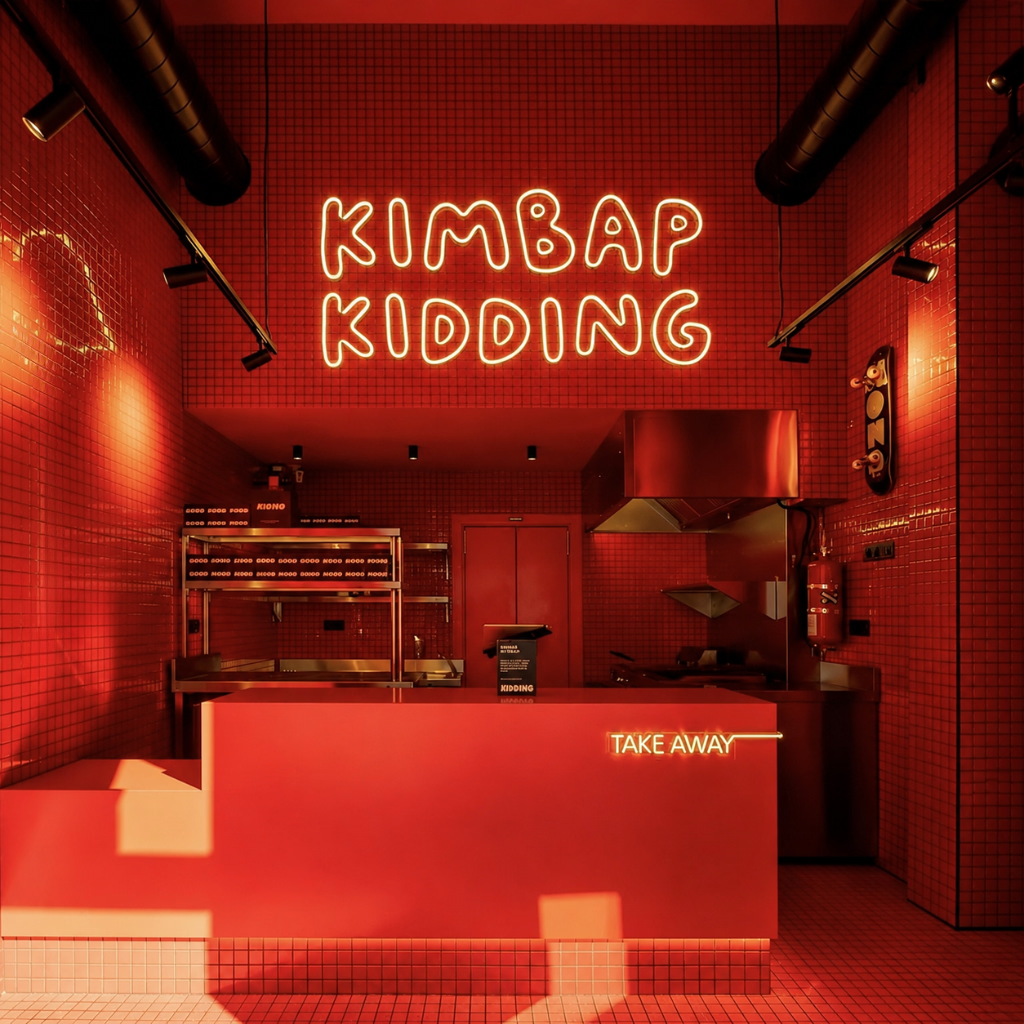
Kimbap Kidding picks up where a good night leaves off: hungry, laughing, and not quite ready to go home. It is Korean street food with a bright-red pulse: fast rolls, full tables, a bag in one hand and the next plan already forming.
Process
System
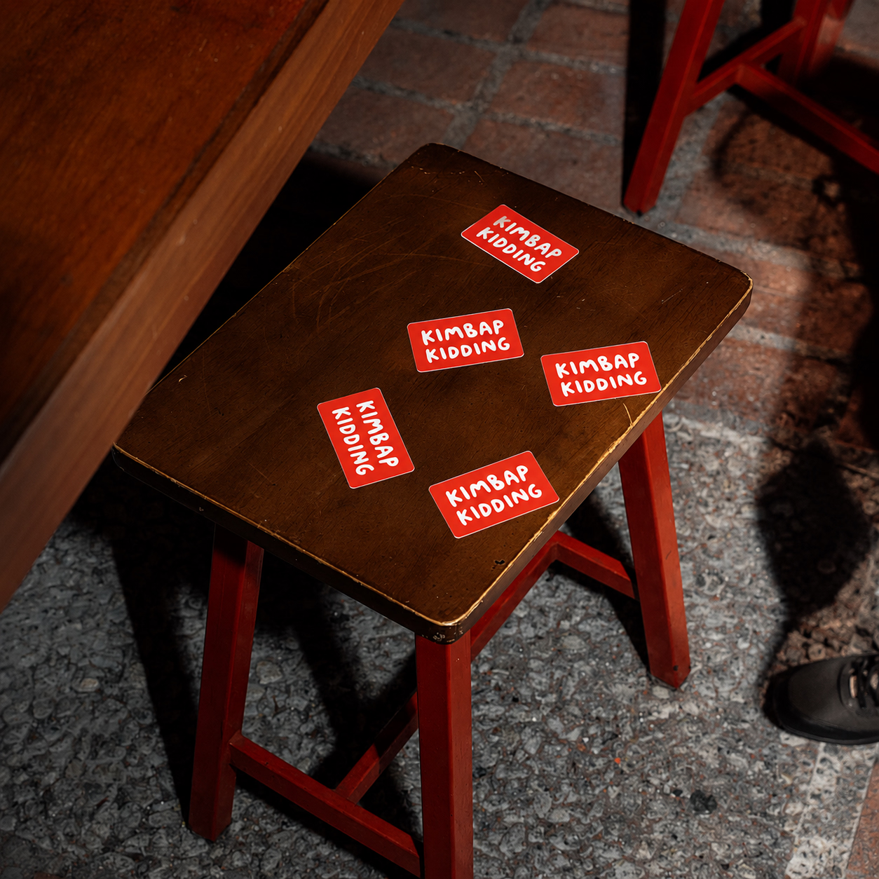
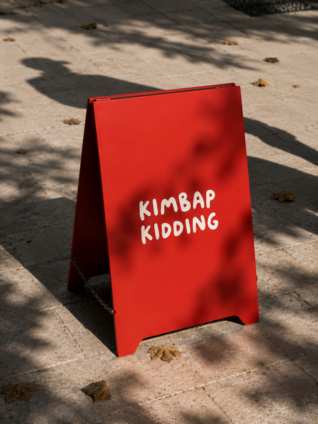
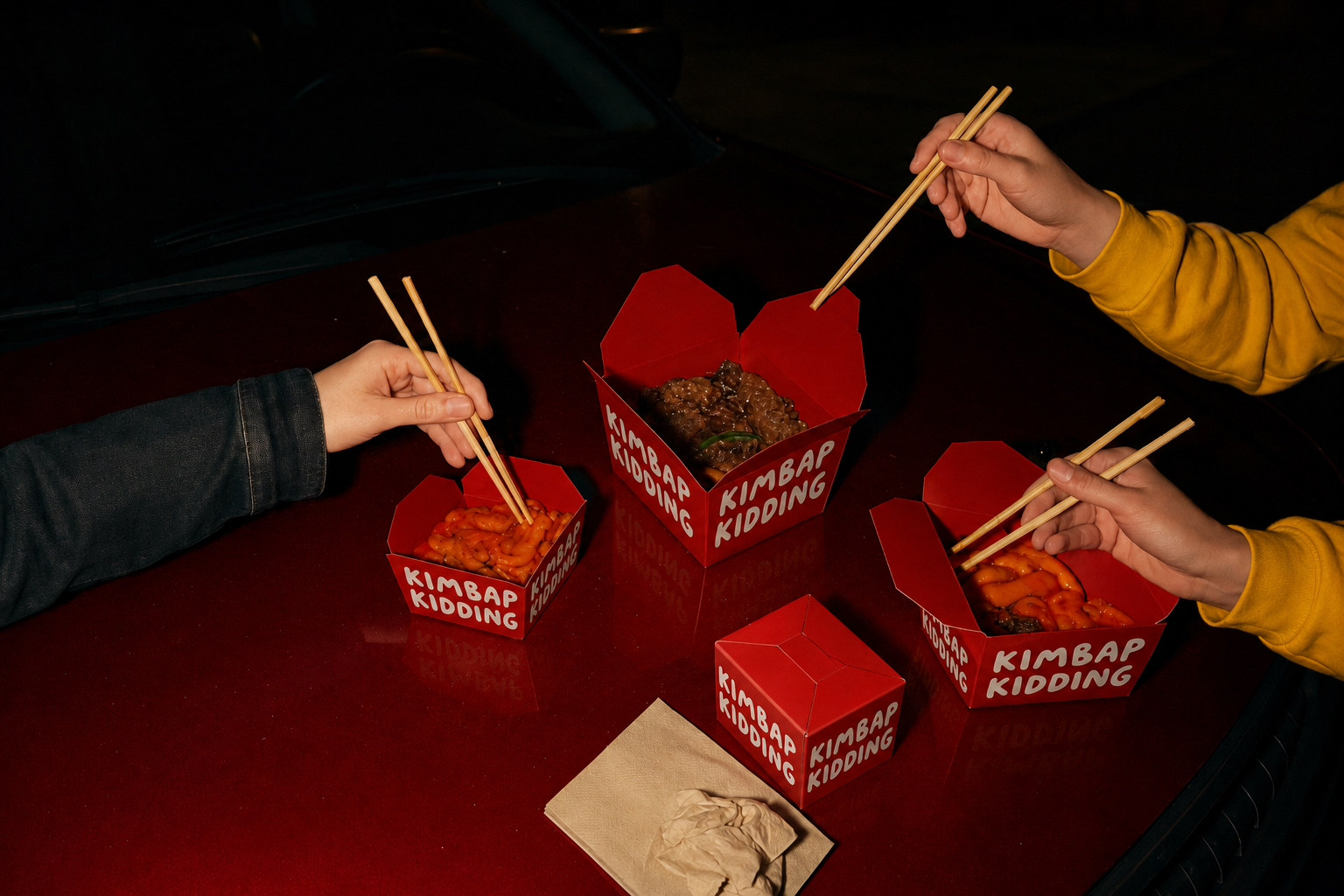
The identity gives that feeling somewhere to live. Loose, friendly lettering meets hard red fields and the familiar round cut of kimbap. On a glowing sign, a table card, or a takeaway bag, it feels direct and a little mischievous: food for people who showed up happy and intend to stay that way.
Behaviour
Everything keeps moving. Repeated circles become a quick visual rhythm across the menu and packaging; simple marks make room for the food, the chatter, and the inevitable "one more order." The result is a brand built for the street, the after-hours detour, and the part of the evening that gets better after dinner.