
Articles
Articles
Cambrian Forum is a brand identity studio.
The mark, the system, and the behaviour are designed along with the brand and the world it has to live in.
For anyone who's anyone.
- archestimatorArchestimator is a pre-release construction estimating application for AEC teams. Structured estimates, reusable cost components and templates, editable Excel output, and browser-based proposal review keep the working number connected to the discussion, revision, and response that follow.
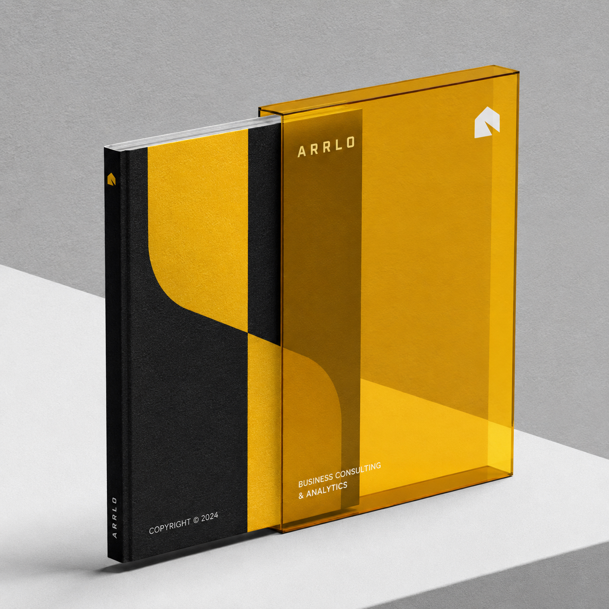
- ArrloArrlo is a design-and-build construction company bringing architectural thinking and on-site delivery under one name. Its brand identity balances the precision of a drawing set with the warmth of a finished space, presenting the company as a single partner from early concept through construction.
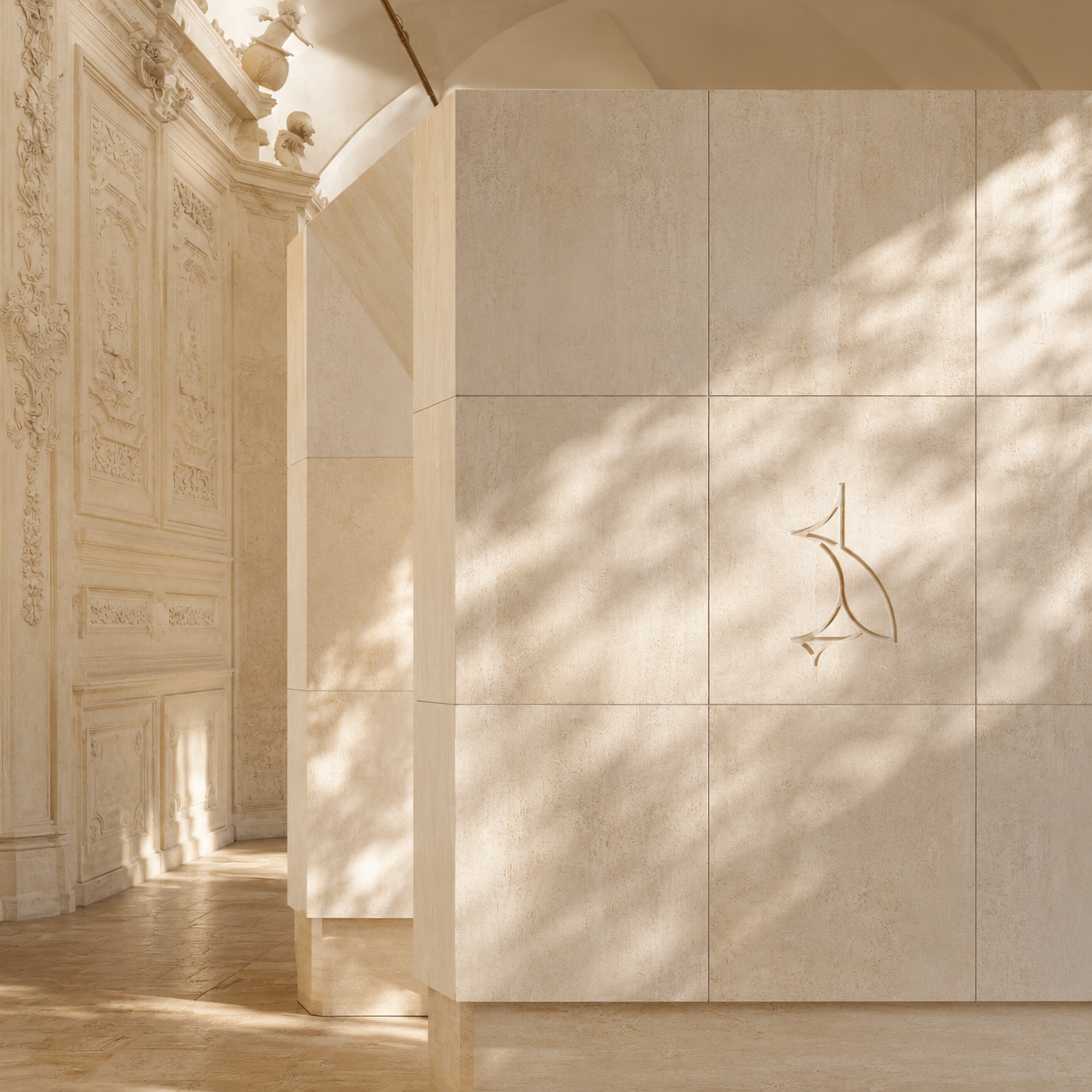
- Balai ResortBalai is a high-end resort concept for Cebu, shaped by a simple provocation: what if tropical luxury loosened its collar? It keeps the calm, craft, and exacting care expected of the best resorts, then lets in salt, appetite, movement, and a little mischief. This is hospitality for guests who notice the thread count but would rather not talk about it.

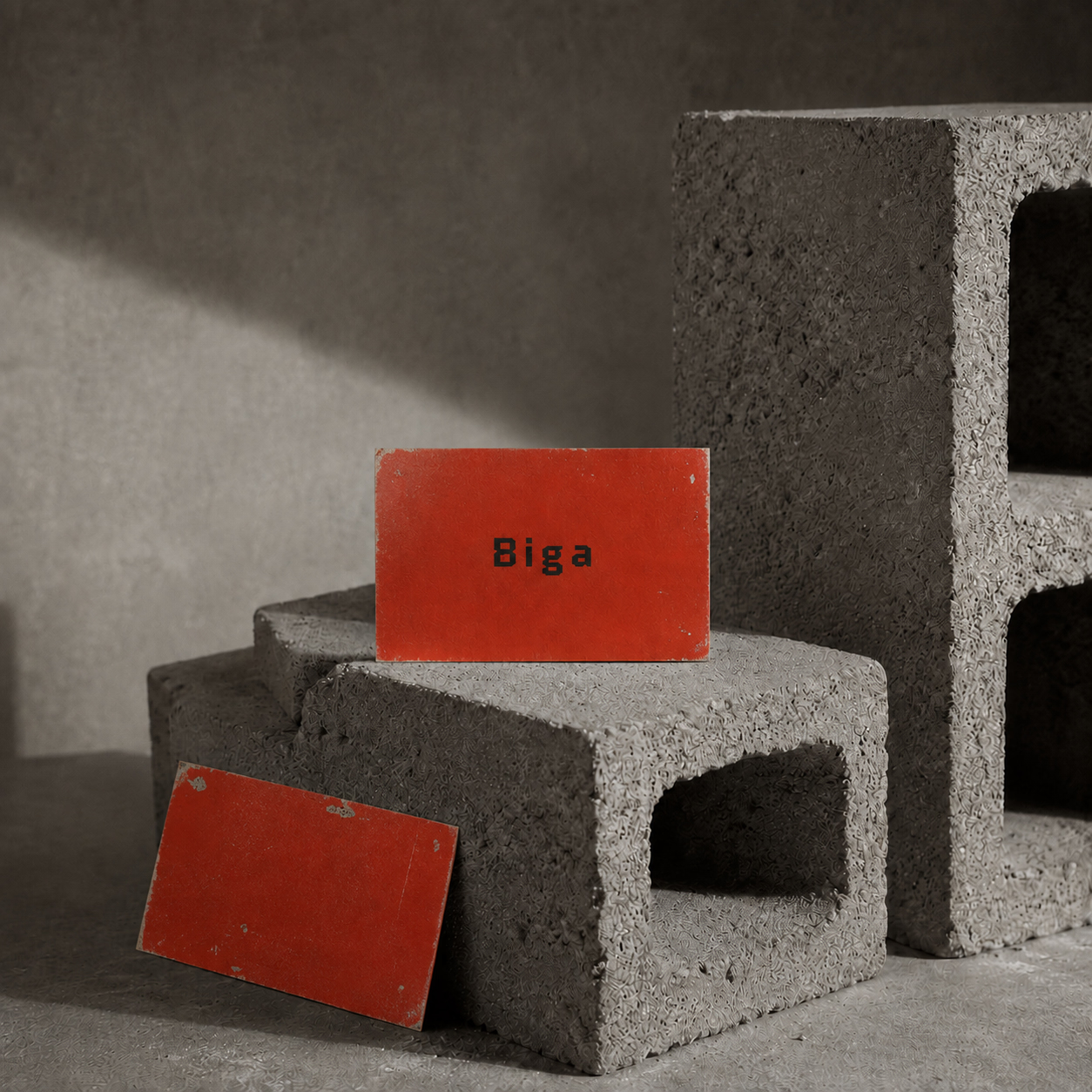
- BigaBiga is a hardware store identity built around weight, utility, and everyday expertise. The name's association with a structural beam gives the brand a useful foundation: dependable materials, clear advice, and a visual system made to work from a shopfront sign to a shelf label.
- FNDMNTLFNDMNTL sits between disciplined luxury and elevated streetwear. The name pares *fundamental* down to its structure while leaving two ideas in view: **FUN** and **MENTAL**. That tension becomes the premise of the identity: essentials shaped with precision, then loosened by curiosity, movement, and play.

- LightitudeLightitude is an architectural lighting supplier identity built around the difference between specifying a fixture and shaping an atmosphere. The brand pairs technical clarity with a more expressive point of view, helping product information, lighting advice, and visual inspiration sit inside one coherent system.

- Museo PambataMuseo Pambata asks a serious question in a joyful register: how should a national museum for children introduce itself to the imagination?
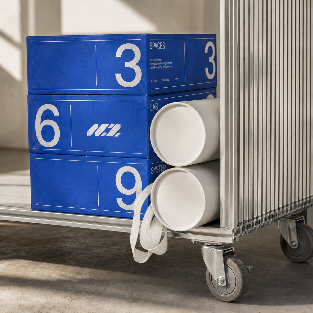
- NCZNCZ is a design-and-build construction company identity shaped around coordination: one team carrying a project from planning through execution. The brand uses a compact three-letter name to communicate confidence and continuity across proposals, site graphics, project documentation, and digital touchpoints.
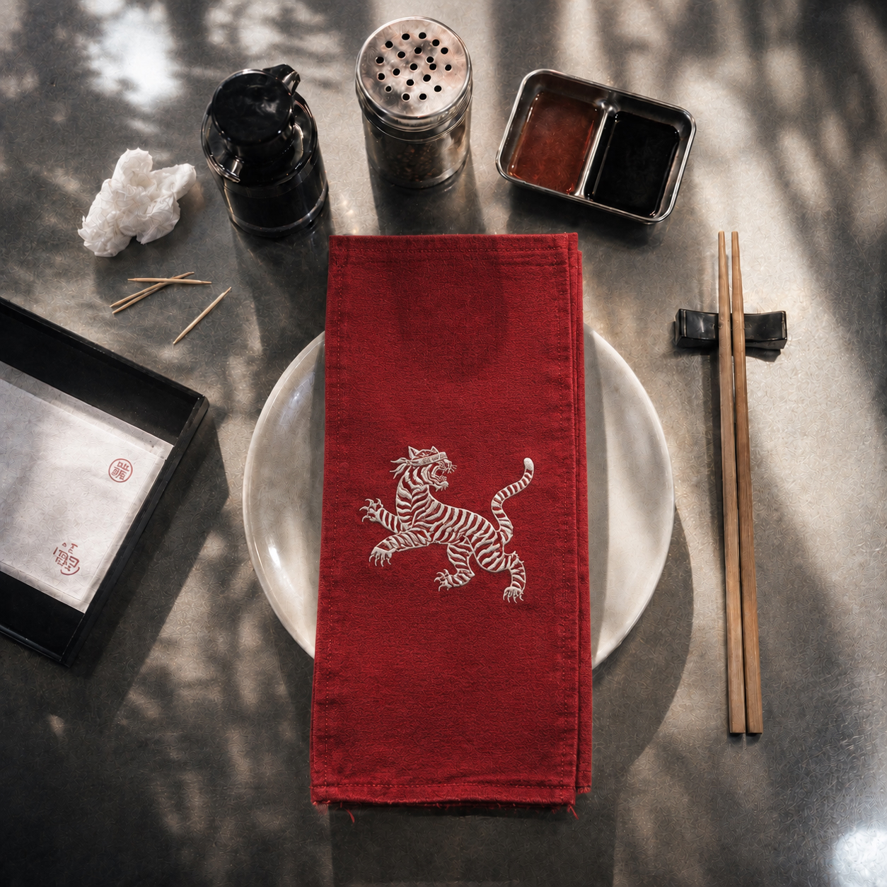
- Blind TigerBlind Tiger is a bar and dining concept that draws on the coded language of old speakeasies without turning the experience into costume. Discretion meets mischief in a hospitality brand that feels hidden enough to discover, but clear enough to remember.
- Cambrian ForumCambrian Forum is an independent brand identity design studio presented as a living editorial archive. A compact hand-drawn mark, restrained typography, and a shifting halftone field give the portfolio a recognizable presence without competing with the work it holds.

- Chicken ClubChicken Club is a restaurant identity built around the easy ritual of sharing a familiar meal. The brand avoids faux-rustic cues and fast-food noise, using a confident name, punchy typography, and a modular graphic system to make the restaurant feel social, current, and unmistakably about chicken.

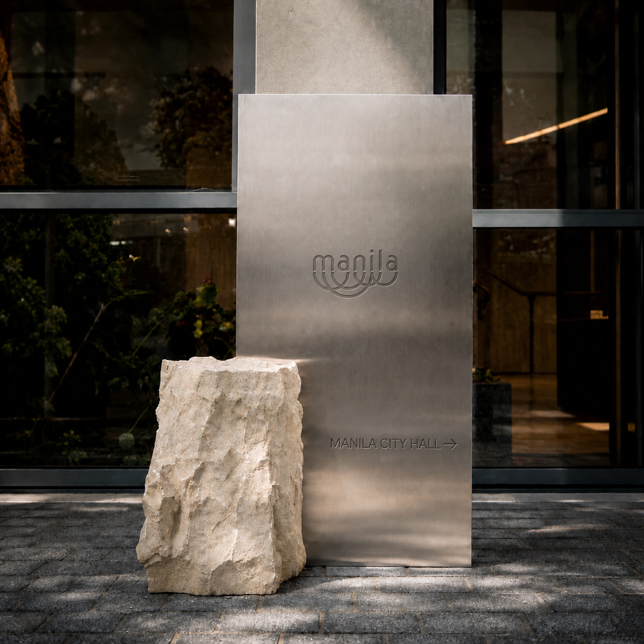
- City Of ManilaCity Of Manila is a civic identity study for a capital shaped by many eras, districts, and daily rhythms. A contemporary public language looks for unity without flattening that complexity, carrying history, municipal information, culture, and street-level life in one framework.
- DatetaskDatetask is a data-driven task management app that turns everyday work into information people can act on. Its product identity makes planning, prioritization, and progress legible without turning the interface into another dense analytics dashboard.

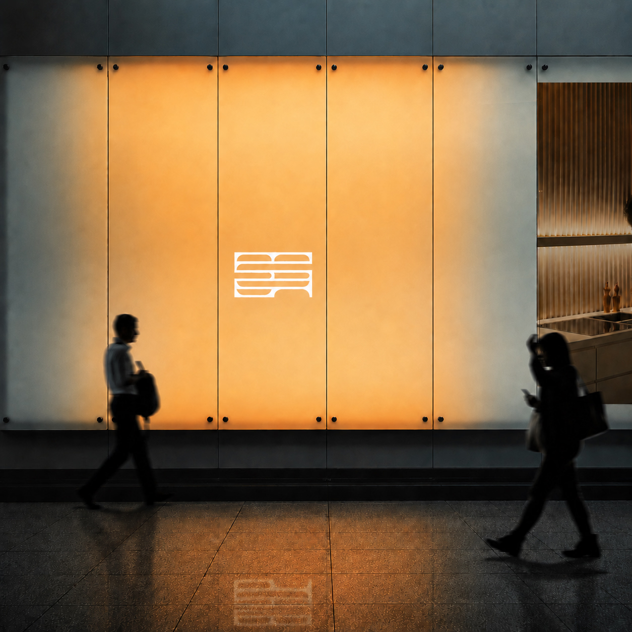
- ELADSELADS—Echavez Lewis Architectural Design Studio—is an architecture practice identity built to let the work speak first. The system resolves a long formal name into a concise acronym, then gives that acronym enough structure to function across drawing sets, presentations, site documents, and a digital portfolio.
- FolkStudioFolkStudio is a Pilates studio identity that makes considered movement feel personal rather than clinical. The brand brings together the precision of Pilates with the ease of a neighborhood studio, creating a welcoming language for classes, instruction, and everyday practice.

- GeoSightGeoSight is a geospatial intelligence concept built around seeing more in location data. Mapping, surveying, and spatial analysis become a clear graphic language positioned between technical accuracy and practical decision-making.

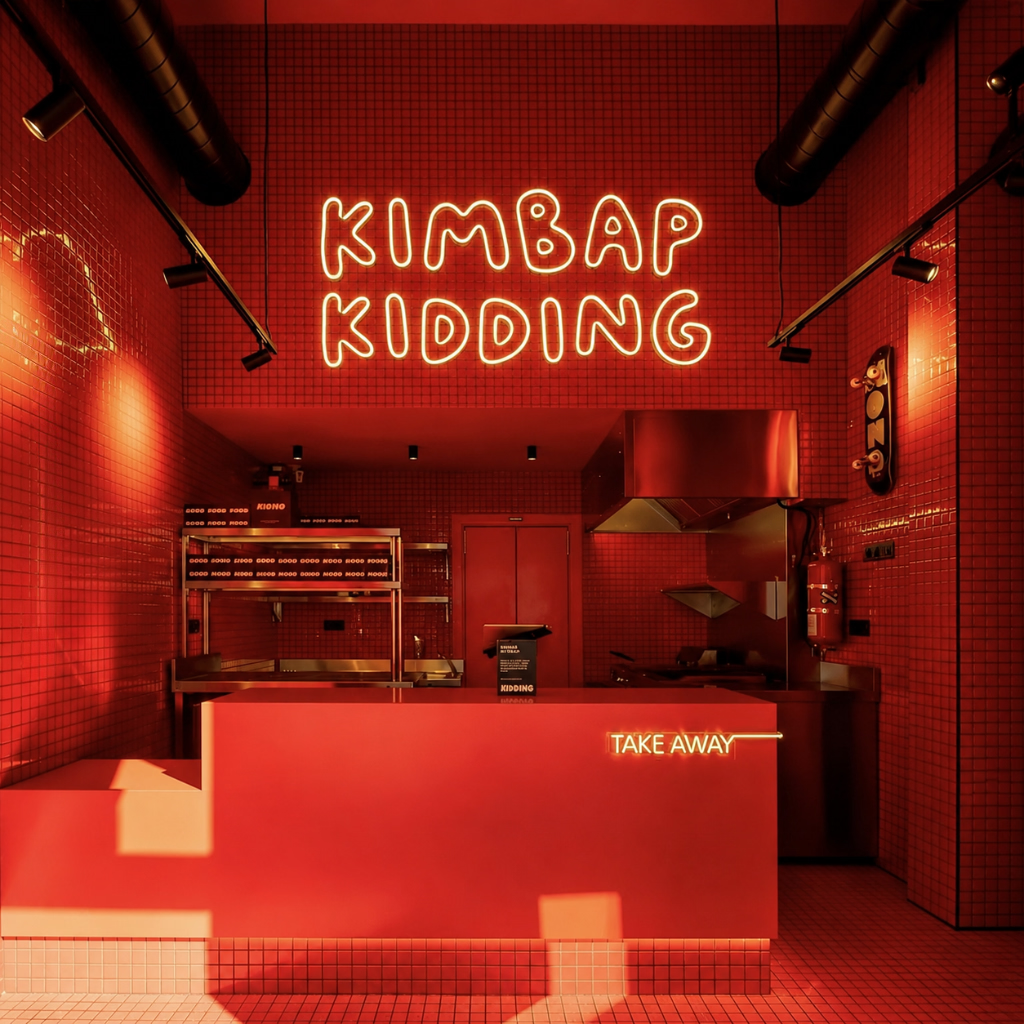
- Kimbap KiddingKimbap Kidding picks up where a good night leaves off: hungry, laughing, and not quite ready to go home. It is Korean street food with a bright-red pulse: fast rolls, full tables, a bag in one hand and the next plan already forming.
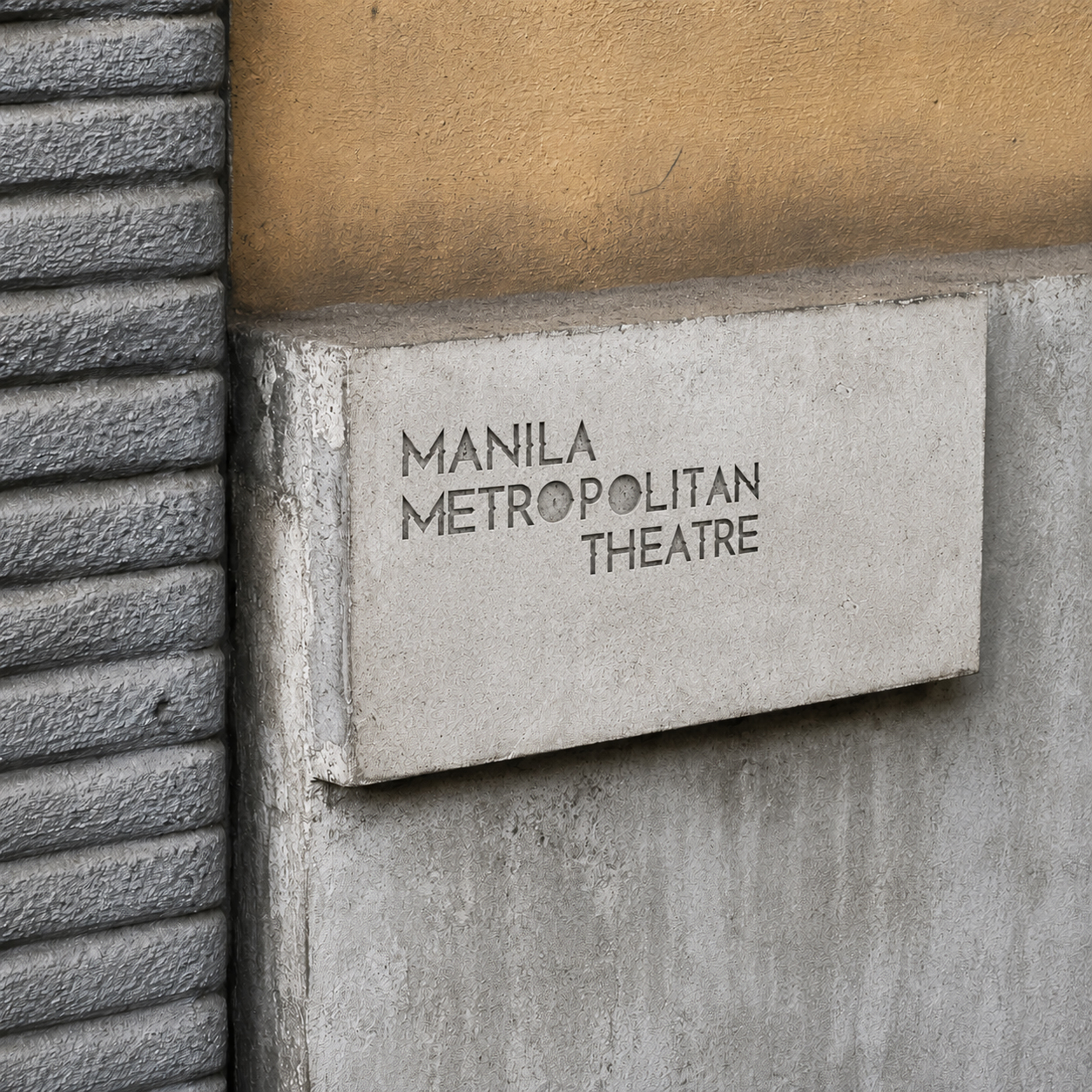
- Manila MetropolitanManila Metropolitan is an editorial identity for looking at the city as a connected, changing region rather than a single postcard view. The project creates a framework for architecture, culture, movement, and everyday urban life across Metropolitan Manila.
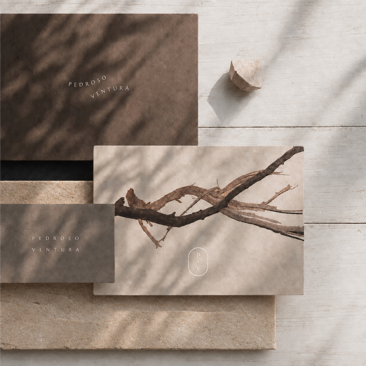
- Pedroso + VenturaPedroso + Ventura is an architectural design firm identity centered on partnership, proportion, and the discipline of the drawing. The wordmark gives equal weight to both names, while the plus sign becomes a practical device for joining ideas, scales, materials, and collaborators.
- SlateCampSlateCamp is a creative retreat and learning concept built around the blank slate: a place to step away, reset, and make something with other people. Its identity combines the usefulness of a workshop with the informality of camp, creating a flexible brand for sessions, field notes, schedules, and shared materials.

- Social Enterprise ConsultingSocial Enterprise Consulting is an advisory brand for organizations trying to hold purpose and commercial discipline in the same frame. Complex strategy becomes structured and approachable through a clear language for research, facilitation, recommendations, and impact-focused work.
- SVTSVT is a compact brand identity system built around the authority and speed of a three-letter name. The acronym never collapses into a literal symbol; proportion, repetition, and controlled contrast create recognition across print, digital, and environmental applications.
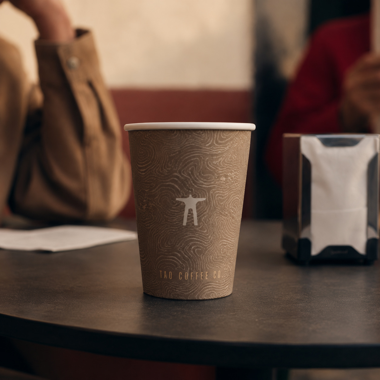
- Tao Coffee CoTao Coffee Co is a coffee brand built around people as much as product.
- TuniniTunini is a tuna restaurant identity that turns a single-minded menu into a memorable world. The name feels compact and playful; the visual system follows with bold typography, ocean-aware color, and graphic forms drawn from fins, tins, cuts, and the movement of a school of fish.