

Biga
Loading project images
Lorem ipsum dolor sit amet, consectetur adipiscing elit.
Integer vel neque eu libero dignissim pellentesque at vitae felis.
Note
Donec sed augue vitae augue sodales convallis. Nulla facilisi. Vivamus interdum, libero sed posuere volutpat.
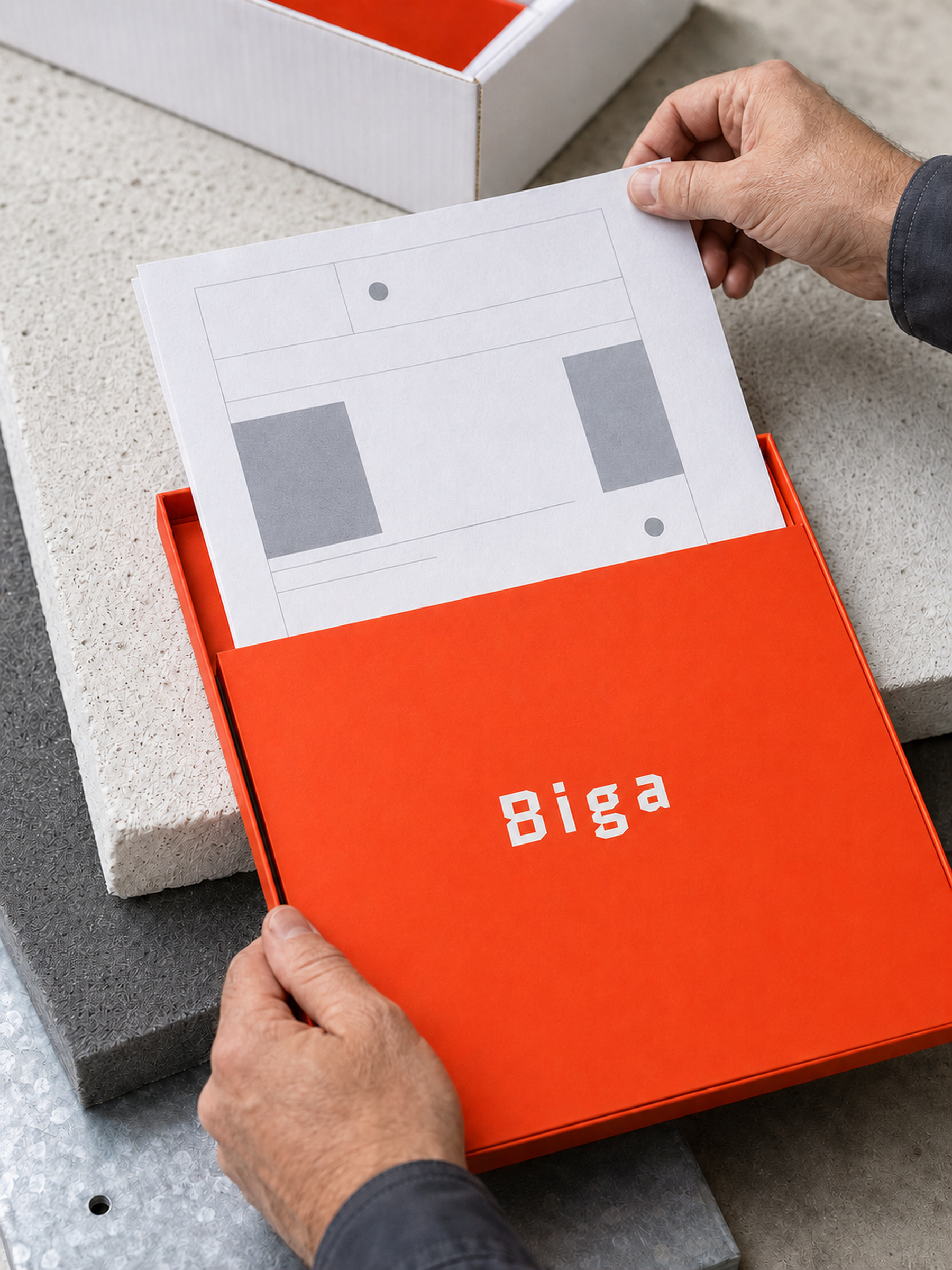
Extract
Pellentesque habitant morbi tristique senectus et netus et malesuada fames ac turpis egestas.
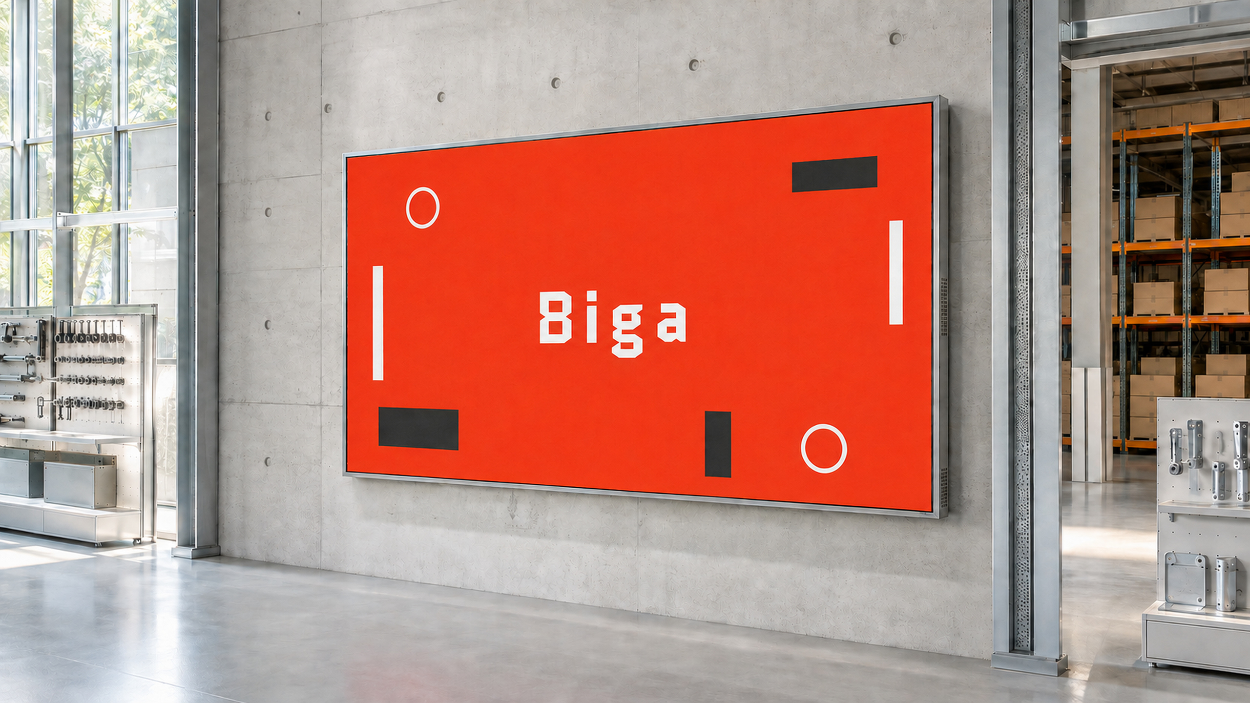
Caption
Praesent et sapien at justo hendrerit cursus. Suspendisse potenti. Aliquam erat volutpat.
- #E6E5E8
- #DEE2BC
- #D6DEE8
- #D9D7D5
- #D6D2CE
- #CBD2B1
- #CBC9CB
- #BCB7B8
- #B4AFAC
- #D69A92
- #9E9D9F
- #F16941
- #D47269
- #E56545
- #F6421B
- #838385
- #987368
- #D93C20
- #636363
- #9D210D
- #664F3C
- #55402A
- #2F2828
- #121415
Scope of Work
Included services: Brand Strategy, Visual Identity, Packaging.
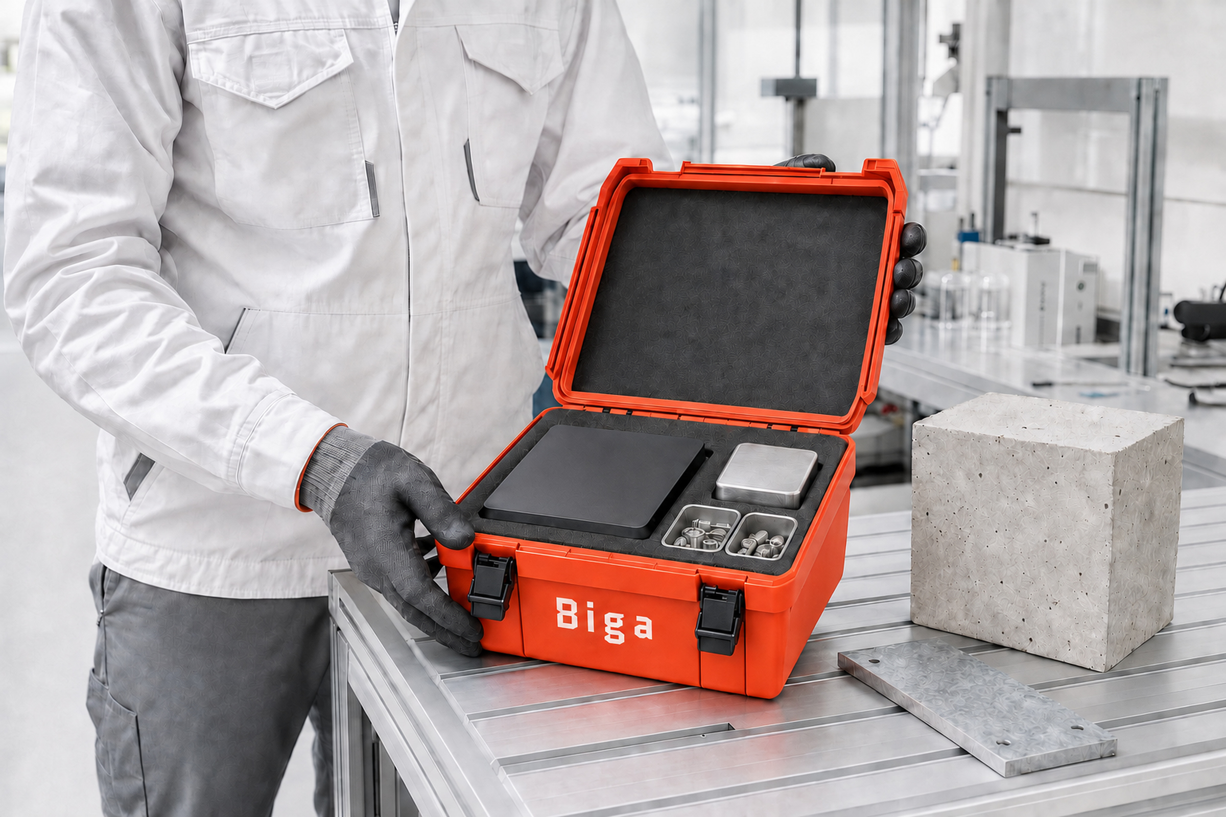
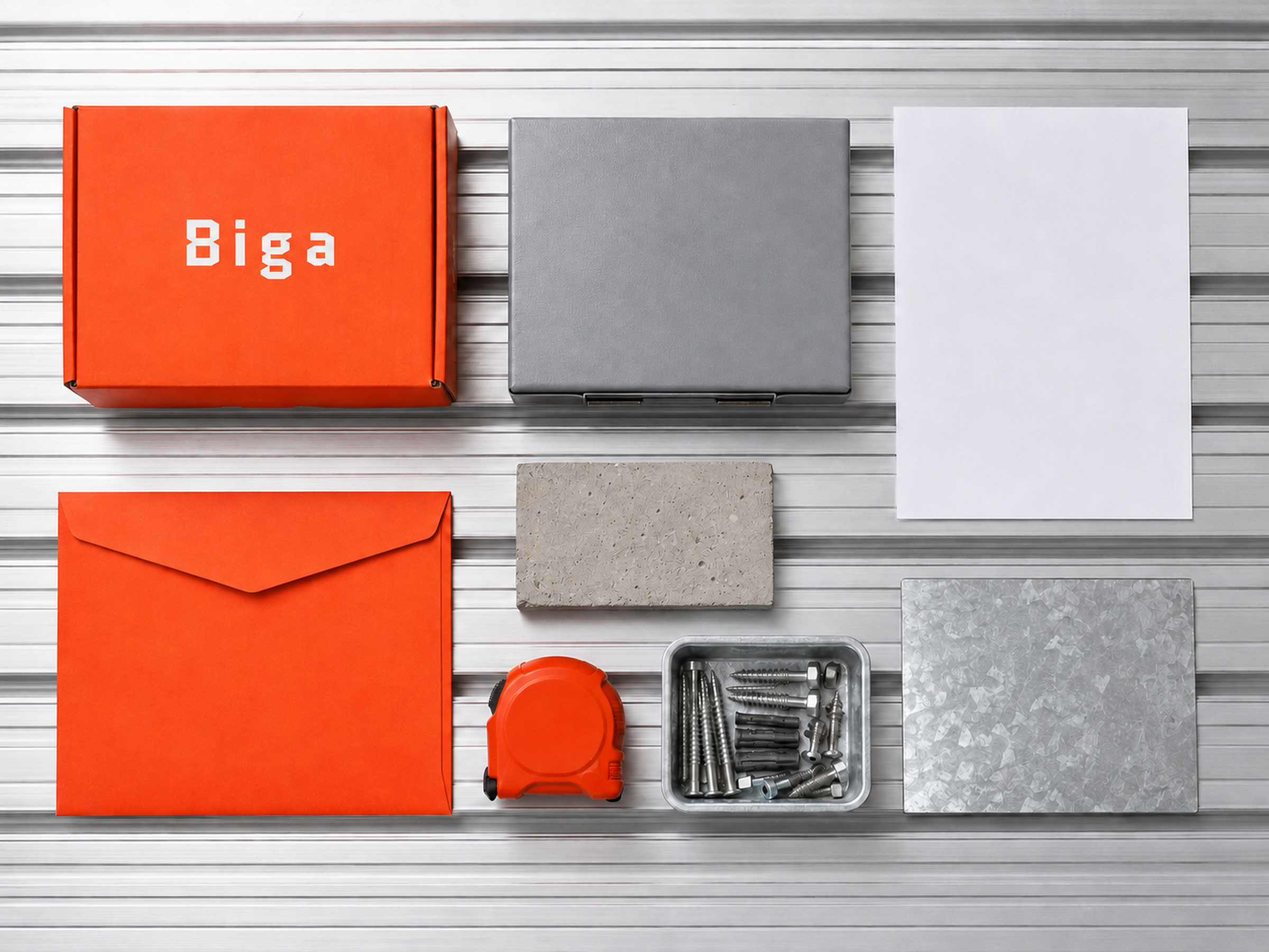
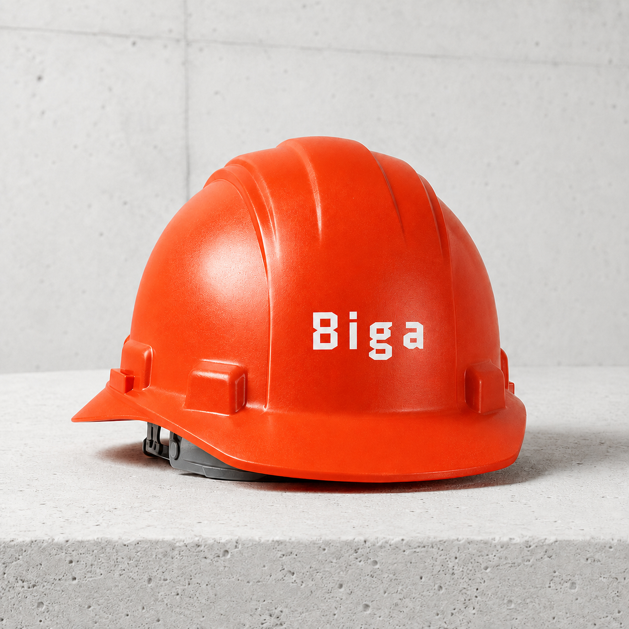
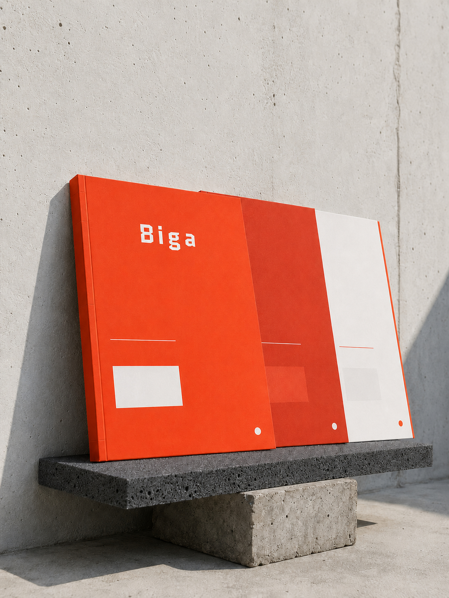
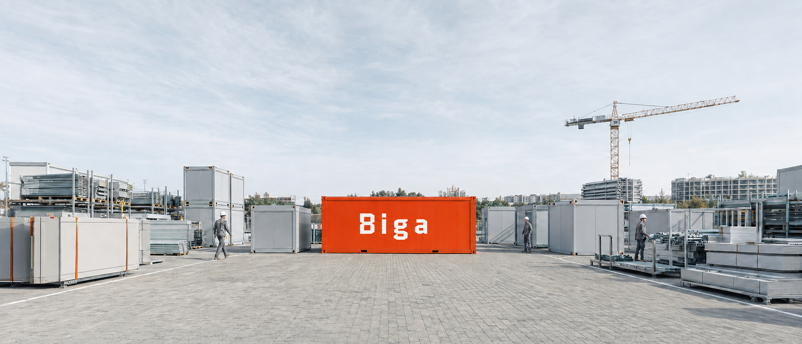
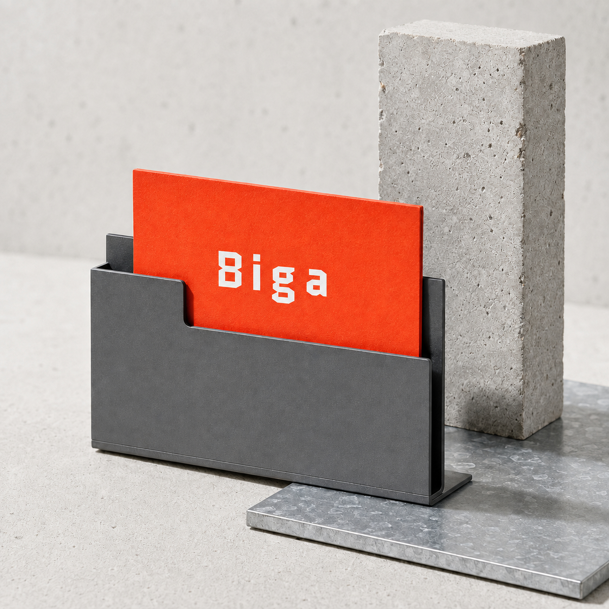
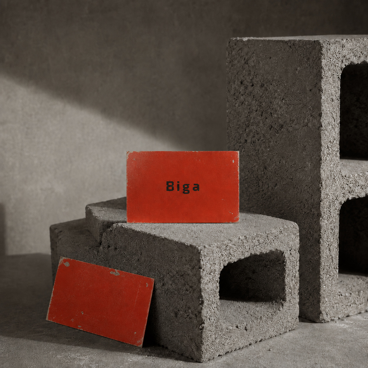
Biga is a hardware store identity built around weight, utility, and everyday expertise. The name's association with a structural beam gives the brand a useful foundation: dependable materials, clear advice, and a visual system made to work from a shopfront sign to a shelf label.
Process
System
Sturdy typography, direct color, and simple graphic units hold their own in a busy retail environment. Product categories, dimensions, and prices remain easy to scan when they compete for attention. The language is practical by design, with enough character to be remembered beyond the transaction.
Behaviour
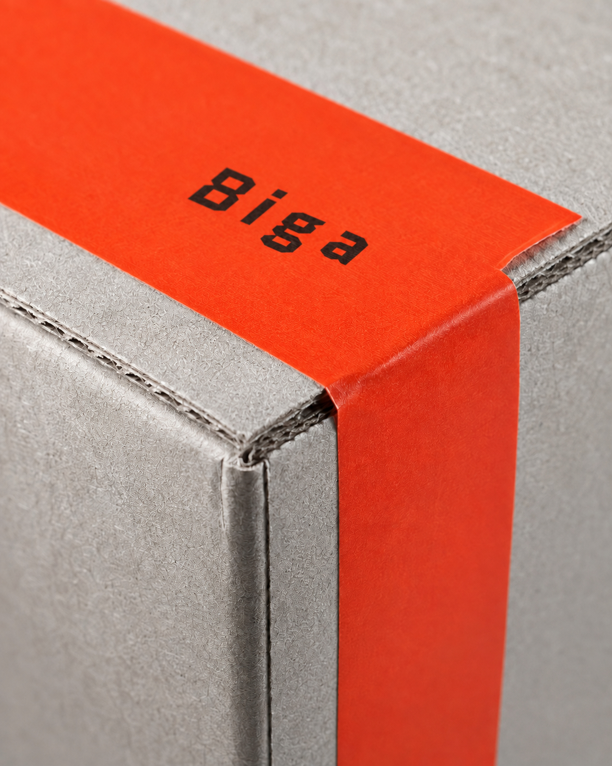
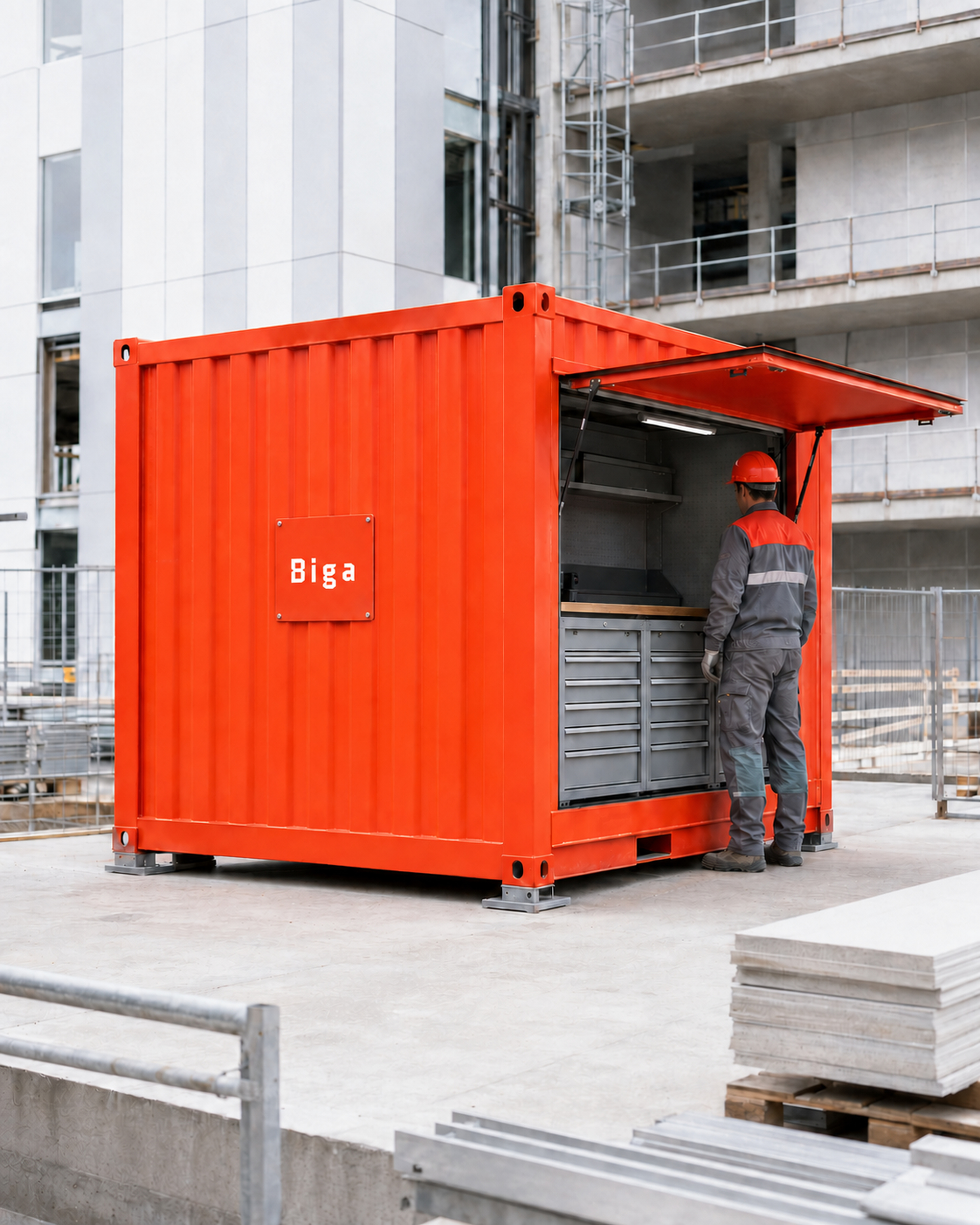
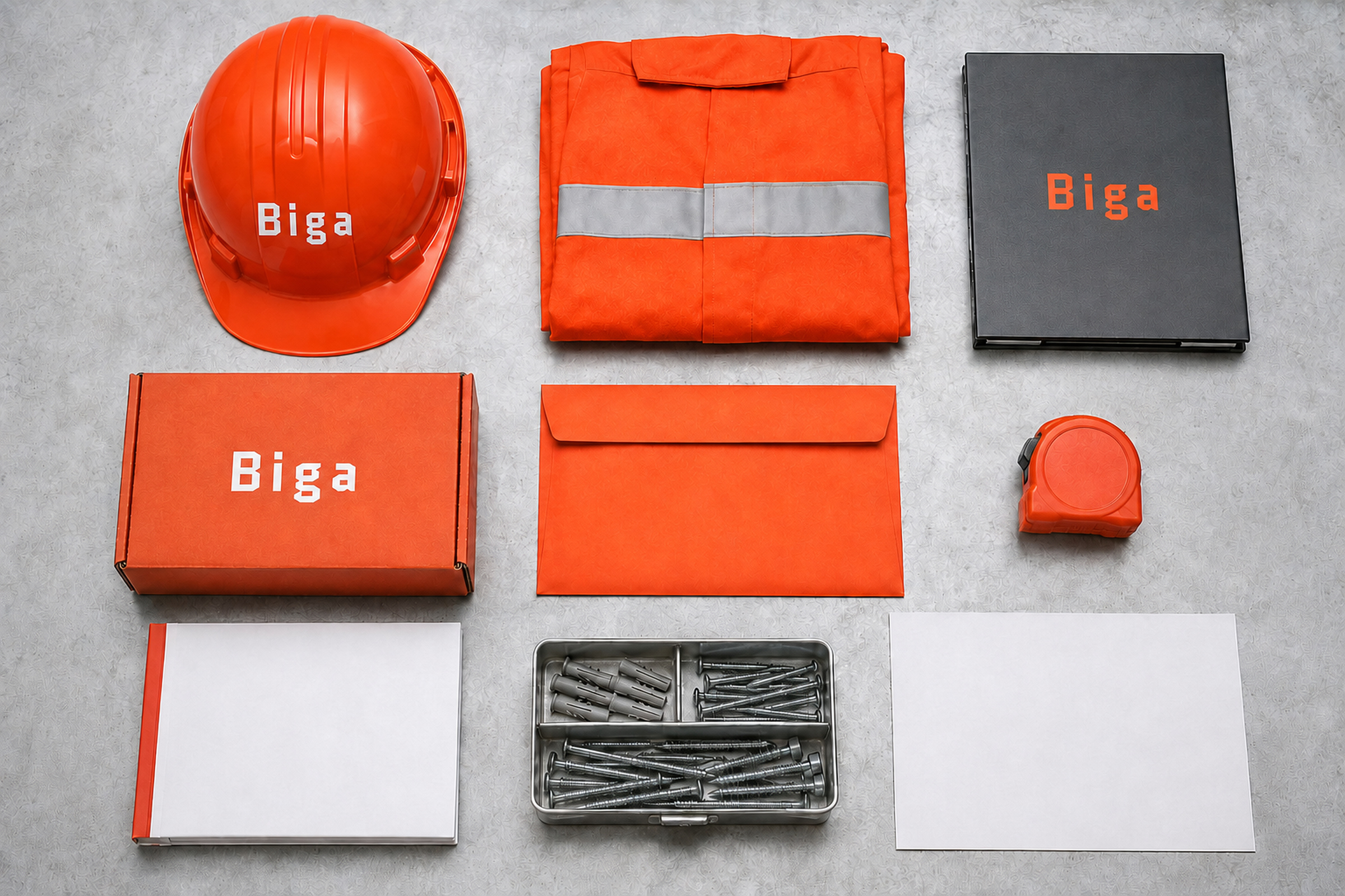
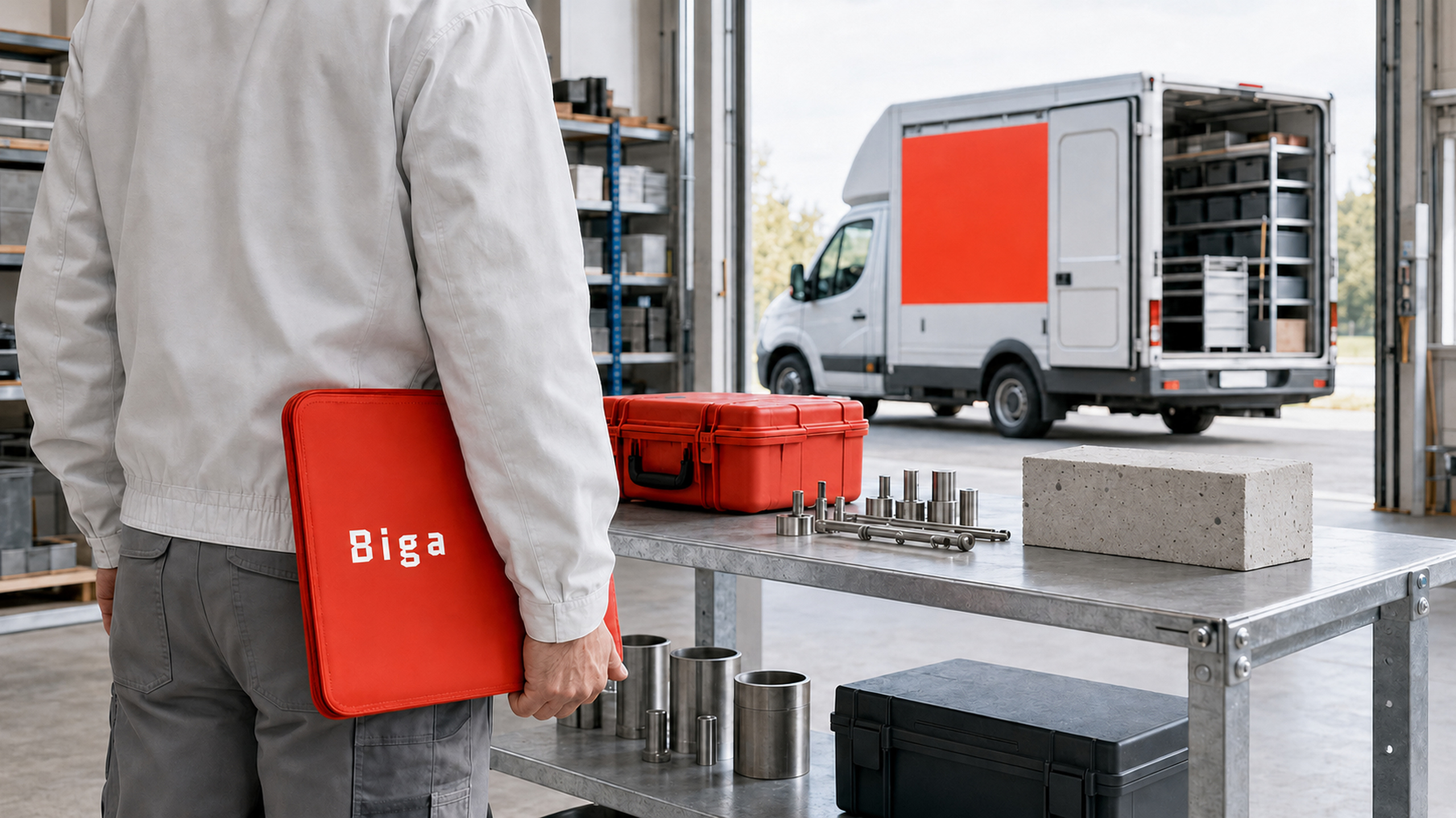
Packaging, uniforms, delivery markings, and in-store navigation all share the same construction logic. Each element feels like part of a kit: modular, economical, and ready for use.