
Pedroso + Ventura
Loading project images
Lorem ipsum dolor sit amet, consectetur adipiscing elit.
Integer vel neque eu libero dignissim pellentesque at vitae felis.
Note
Donec sed augue vitae augue sodales convallis. Nulla facilisi. Vivamus interdum, libero sed posuere volutpat.
Extract
Pellentesque habitant morbi tristique senectus et netus et malesuada fames ac turpis egestas.
Caption
Praesent et sapien at justo hendrerit cursus. Suspendisse potenti. Aliquam erat volutpat.
Scope of Work
Included services: Brand Strategy, Visual Identity.
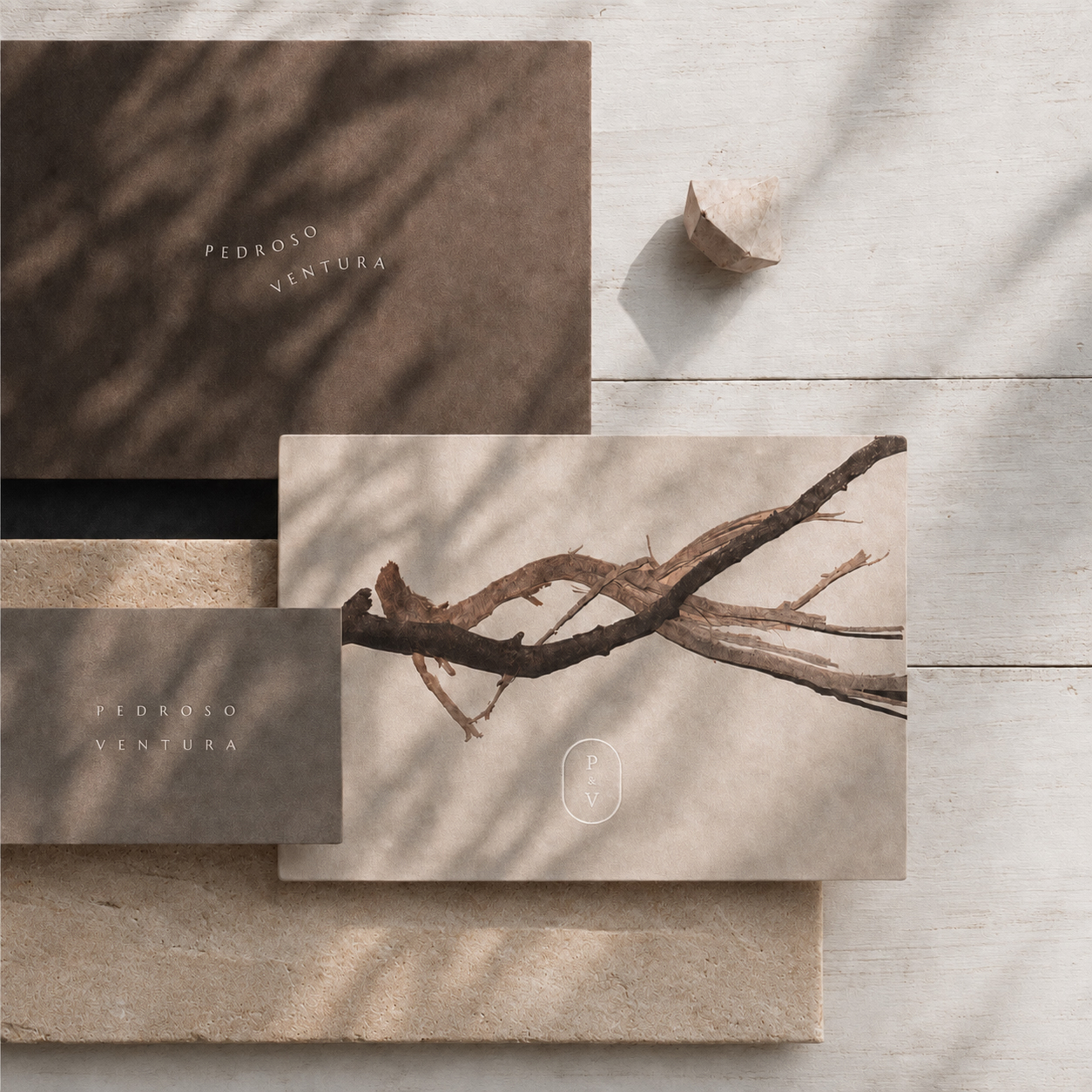
Pedroso + Ventura is an architectural design firm identity centered on partnership, proportion, and the discipline of the drawing. The wordmark gives equal weight to both names, while the plus sign becomes a practical device for joining ideas, scales, materials, and collaborators.
Process
System
The restraint is deliberate. Precise typography, measured grids, and generous image fields create an editorial frame for architecture without imposing a house style on every project. Technical information can sit beside photography and drawings with the same level of care.
Behaviour
From proposals and competition boards to site documents and the studio portfolio, the identity presents Pedroso + Ventura as one practice with room for dialogue inside it. The plus is both punctuation and method: a small sign for work made through combination.