

Chicken Club
Loading project images
Lorem ipsum dolor sit amet, consectetur adipiscing elit.
Integer vel neque eu libero dignissim pellentesque at vitae felis.
Note
Donec sed augue vitae augue sodales convallis. Nulla facilisi. Vivamus interdum, libero sed posuere volutpat.
Extract
Pellentesque habitant morbi tristique senectus et netus et malesuada fames ac turpis egestas.
Caption
Praesent et sapien at justo hendrerit cursus. Suspendisse potenti. Aliquam erat volutpat.
Scope of Work
Included services: Brand Strategy, Visual Identity, Packaging, Collaterals.
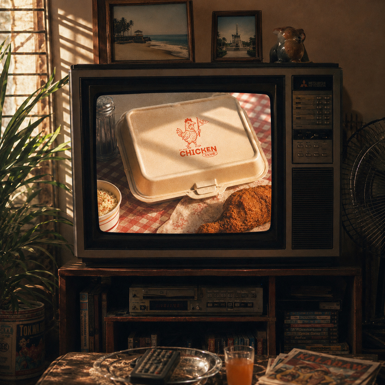
Chicken Club is a restaurant identity built around the easy ritual of sharing a familiar meal. The brand avoids faux-rustic cues and fast-food noise, using a confident name, punchy typography, and a modular graphic system to make the restaurant feel social, current, and unmistakably about chicken.
Process
System
Illustration and type carry most of the personality. Bold shapes can expand across a wall or collapse onto a small sauce label, while a limited palette keeps packaging and menu information easy to recognize at a glance. The tone is playful, but the system remains ordered enough to handle a full restaurant environment.
Behaviour
From dine-in trays to takeaway packs and storefront graphics, every application reinforces the idea of membership. Chicken Club feels less like a themed venue and more like a place people can return to as part of their regular routine.