

Arrlo
Loading project images
Lorem ipsum dolor sit amet, consectetur adipiscing elit.
Integer vel neque eu libero dignissim pellentesque at vitae felis.
Note
Donec sed augue vitae augue sodales convallis. Nulla facilisi. Vivamus interdum, libero sed posuere volutpat.
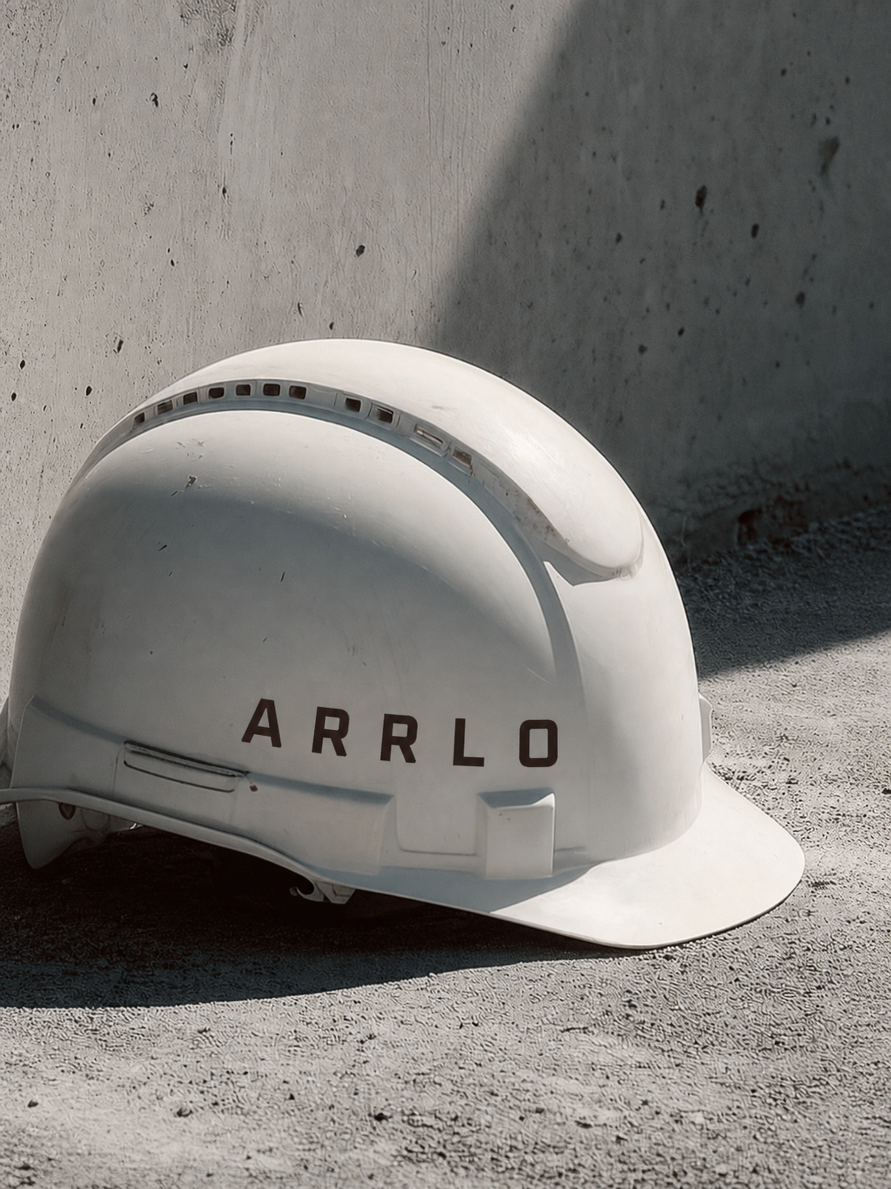
Extract
Pellentesque habitant morbi tristique senectus et netus et malesuada fames ac turpis egestas.
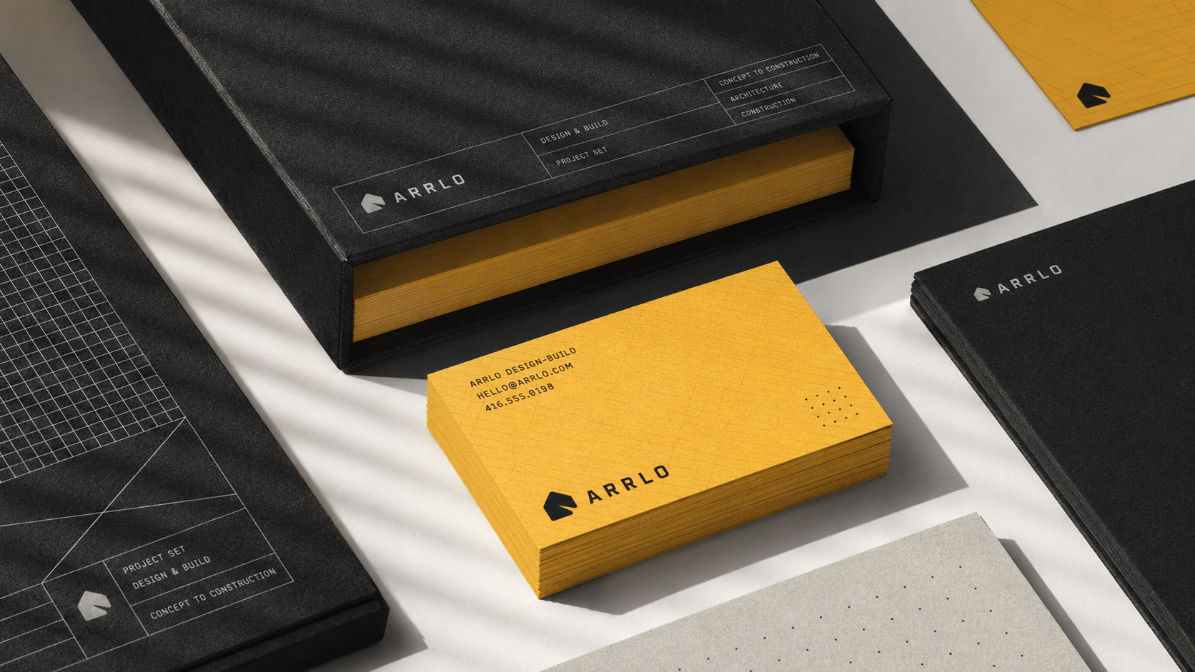
Caption
Praesent et sapien at justo hendrerit cursus. Suspendisse potenti. Aliquam erat volutpat.
- #E6E2DD
- #D7D6D5
- #D3BFA4
- #E7B63E
- #9FBDD4
- #E8AA11
- #DBA75B
- #CAB13A
- #AAA6A3
- #C89724
- #AE7F1C
- #678CAD
- #7B7976
- #8C6E49
- #406D97
- #676866
- #565755
- #494B49
- #4B3024
- #322F2D
- #232322
- #1A1919
- #0C0C0C
- #020202
Scope of Work
Included services: Brand Strategy, Visual Identity, Collaterals.
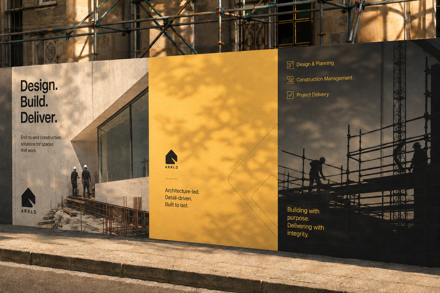
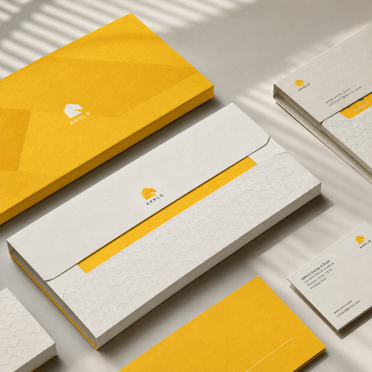
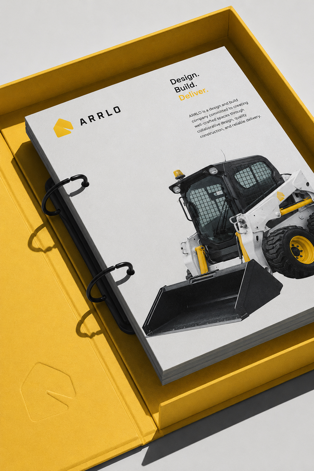
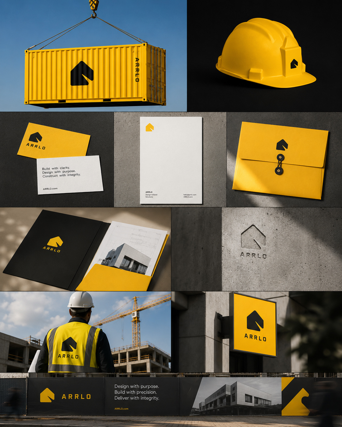
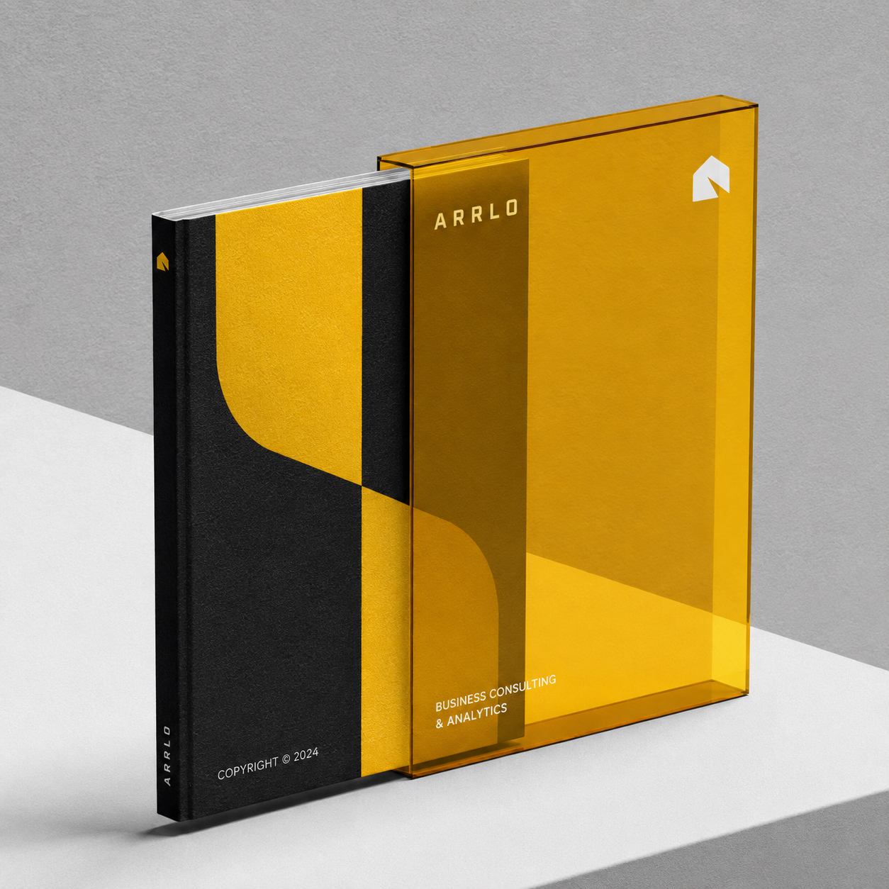
Arrlo is a design-and-build construction company bringing architectural thinking and on-site delivery under one name. Its brand identity balances the precision of a drawing set with the warmth of a finished space, presenting the company as a single partner from early concept through construction.
Process
Mark
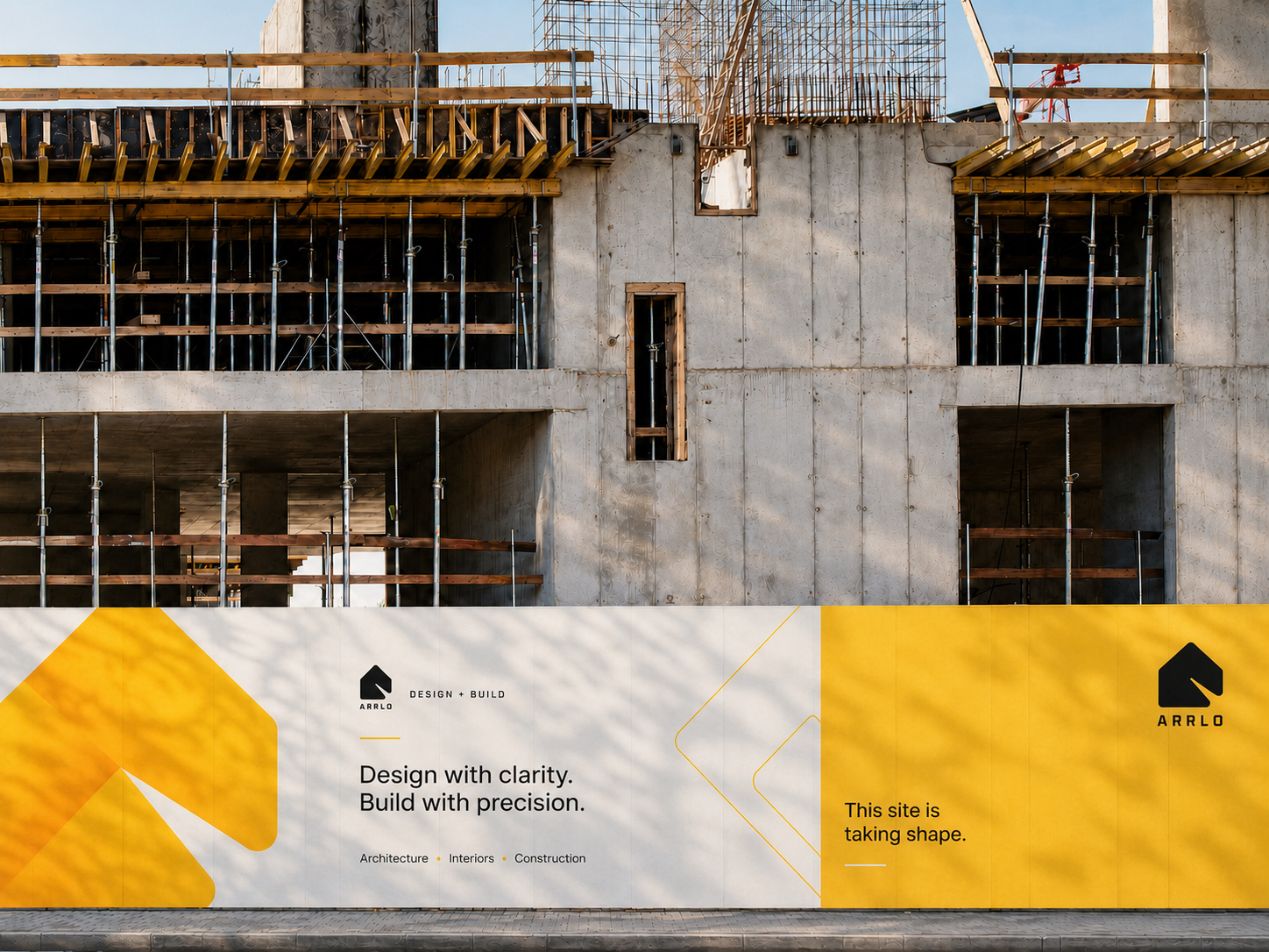
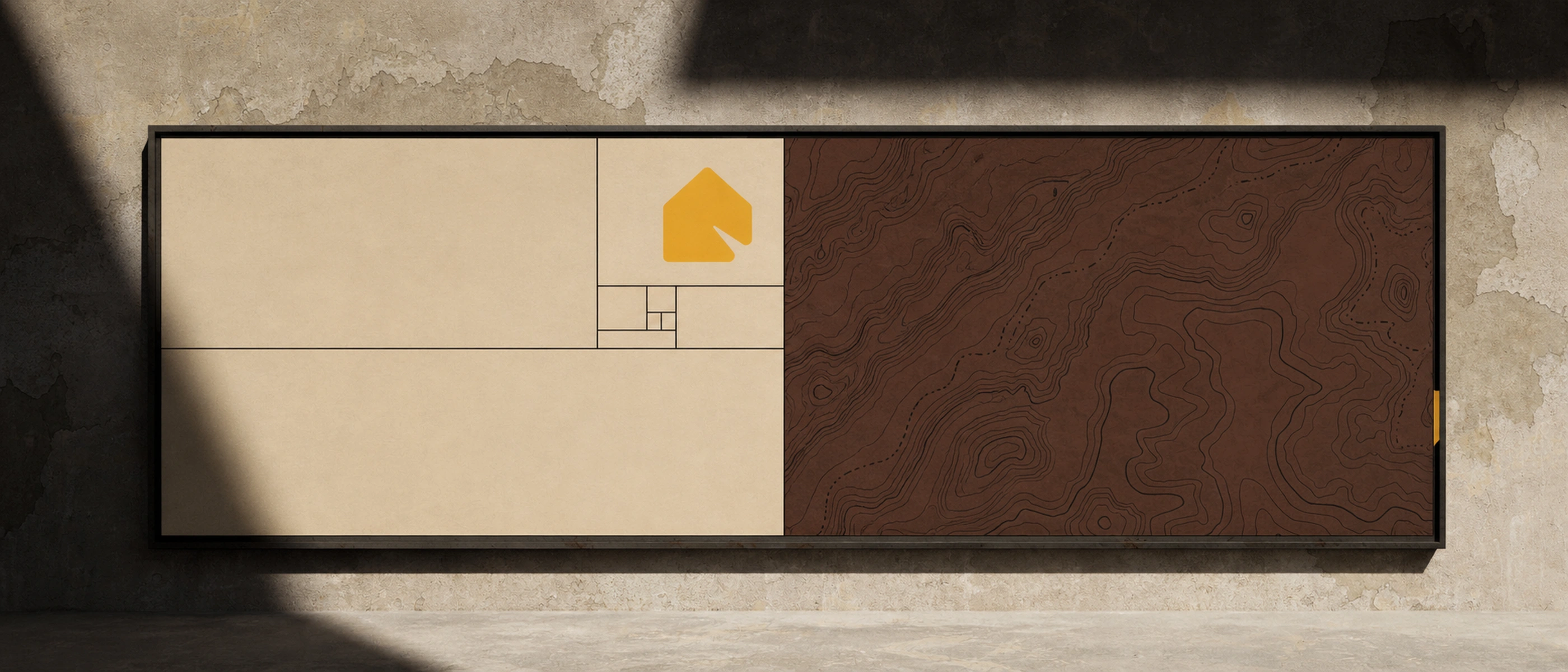
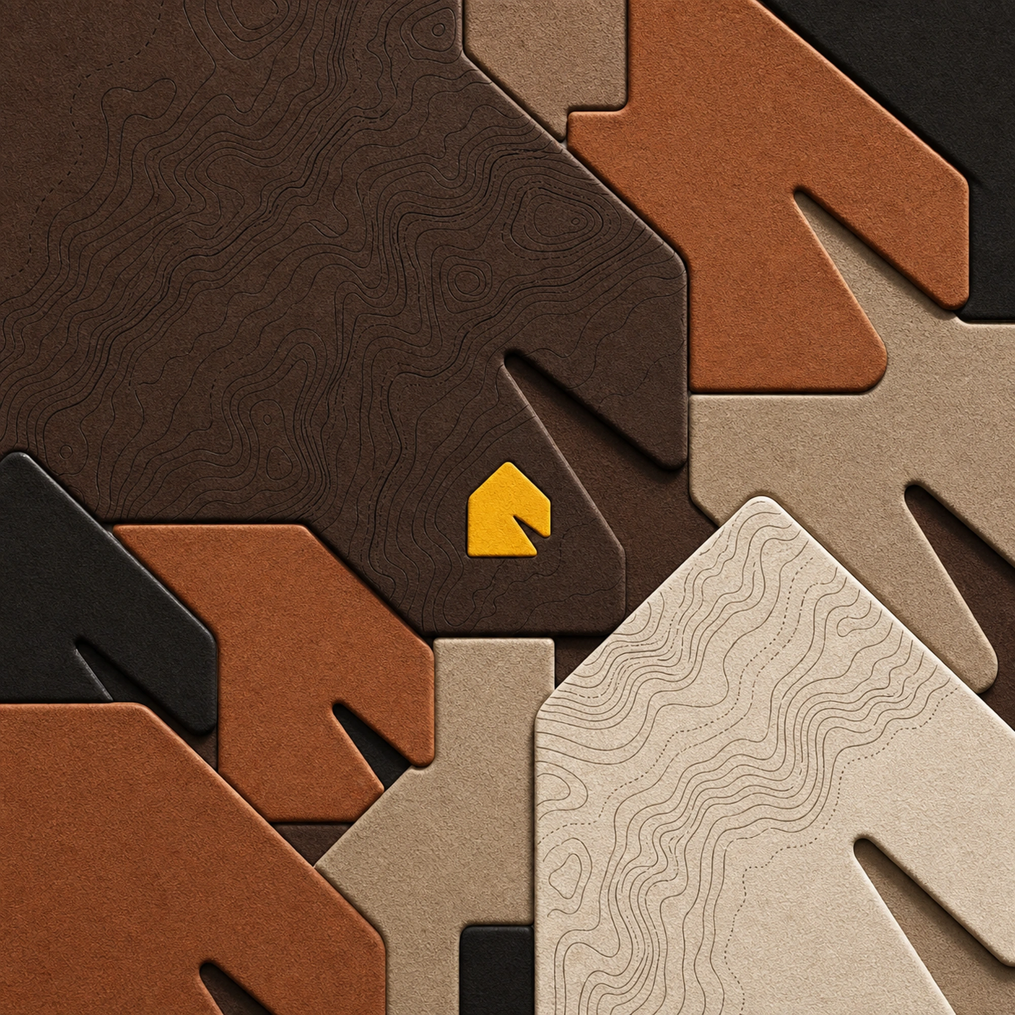
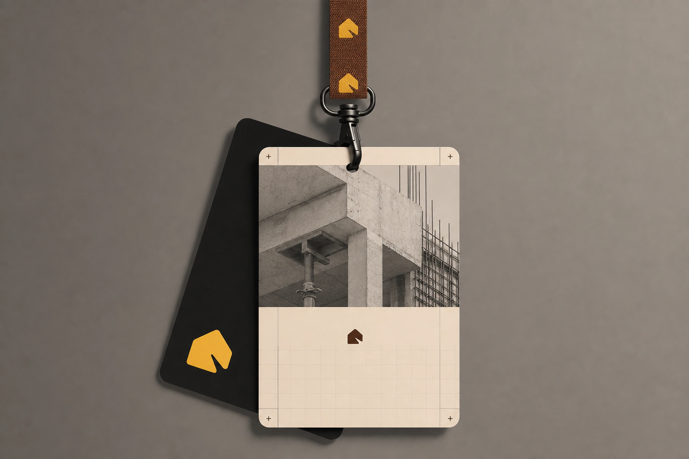
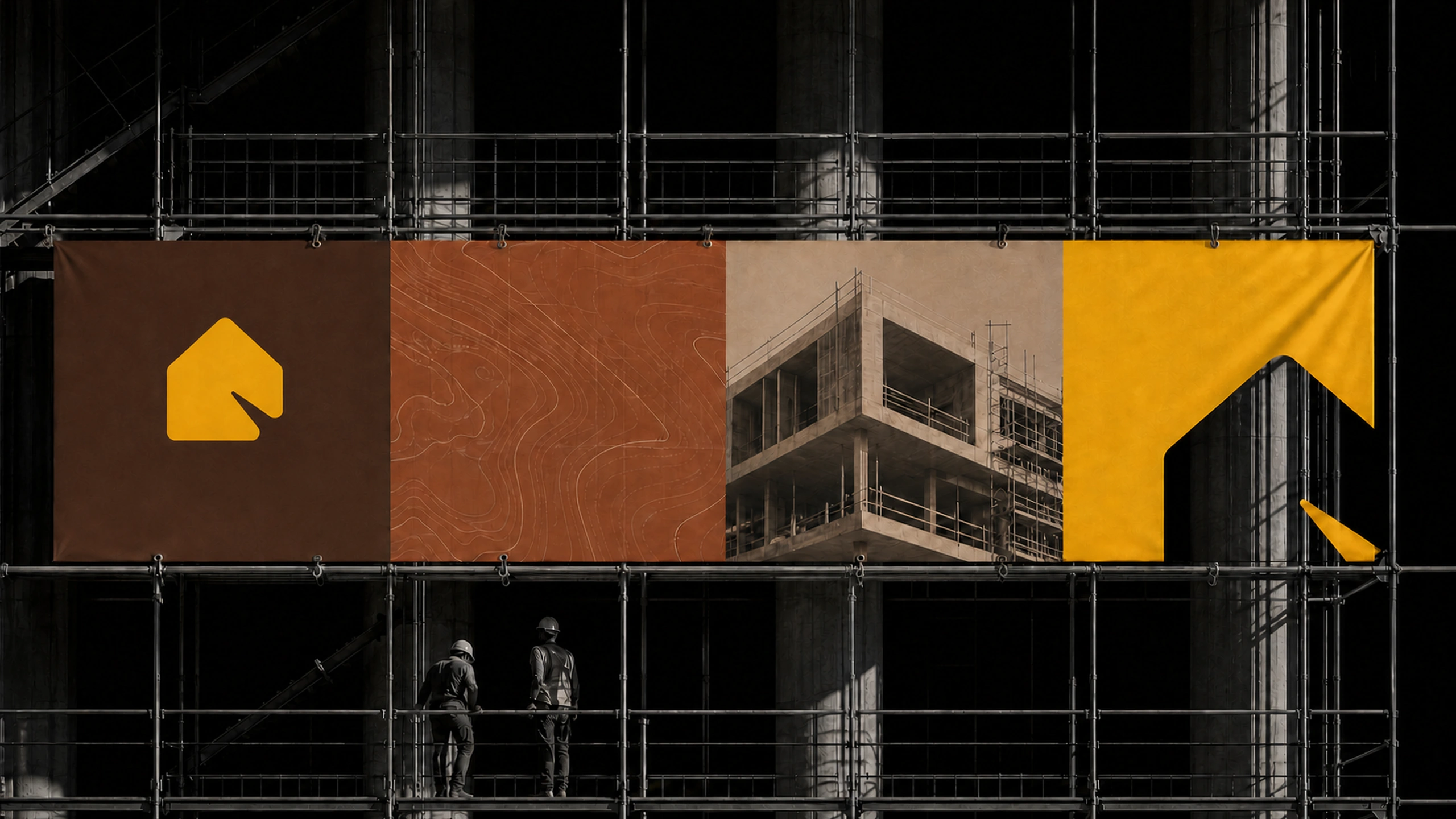
A compact architectural mark gives the system its anchor. It suggests shelter, direction, and assembly without reducing the company to a generic house icon. Warm yellow works as both a confident brand color and a practical signal across plans, presentations, site graphics, and digital communication.
System
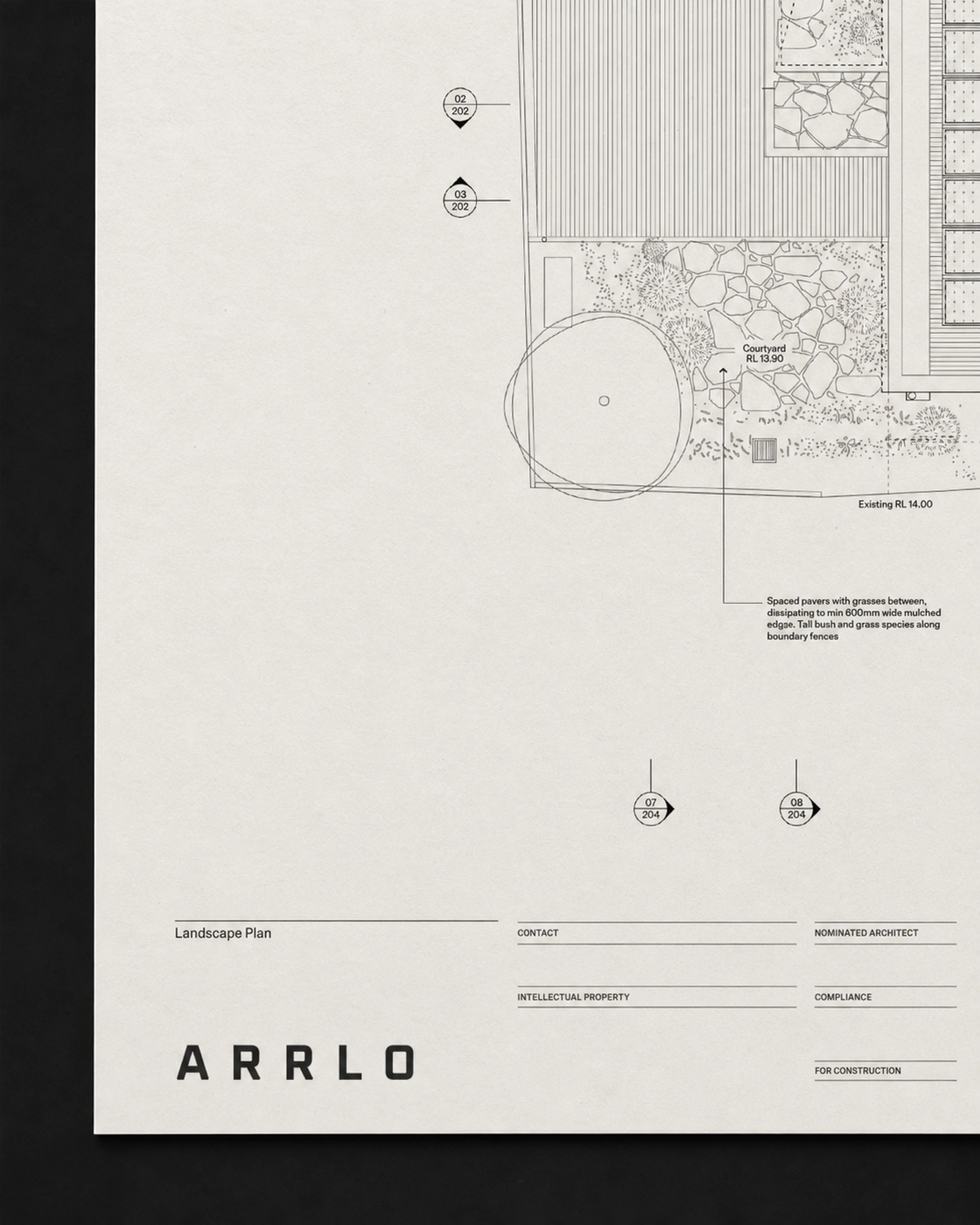
The wider identity is structured for the full life of a project. Clear typography organizes technical information, generous image fields give completed spaces room to speak, and a consistent graphic framework connects the polished presentation with the practical realities of building.